

Vysio
Vysio is a product that sets out to reimagine physiotherapy rehabilitation through enhanced tracking, new communication pathways and comprehensive analytics.
Team
Product Designer (me) 2 Full Stack Developers ML Engineer
Role
Product Direction Interaction Design User Testing Prototyping
Tools
Figma, Notion, TailwindCSS
Duration
September 2021 - May 2022
SHORTCUTS
Project Overview
MISSION STATEMENT
Vysio seeks to improve data visibility and communication between practitioners and clients, leading to improved client outcomes.
MEDIA
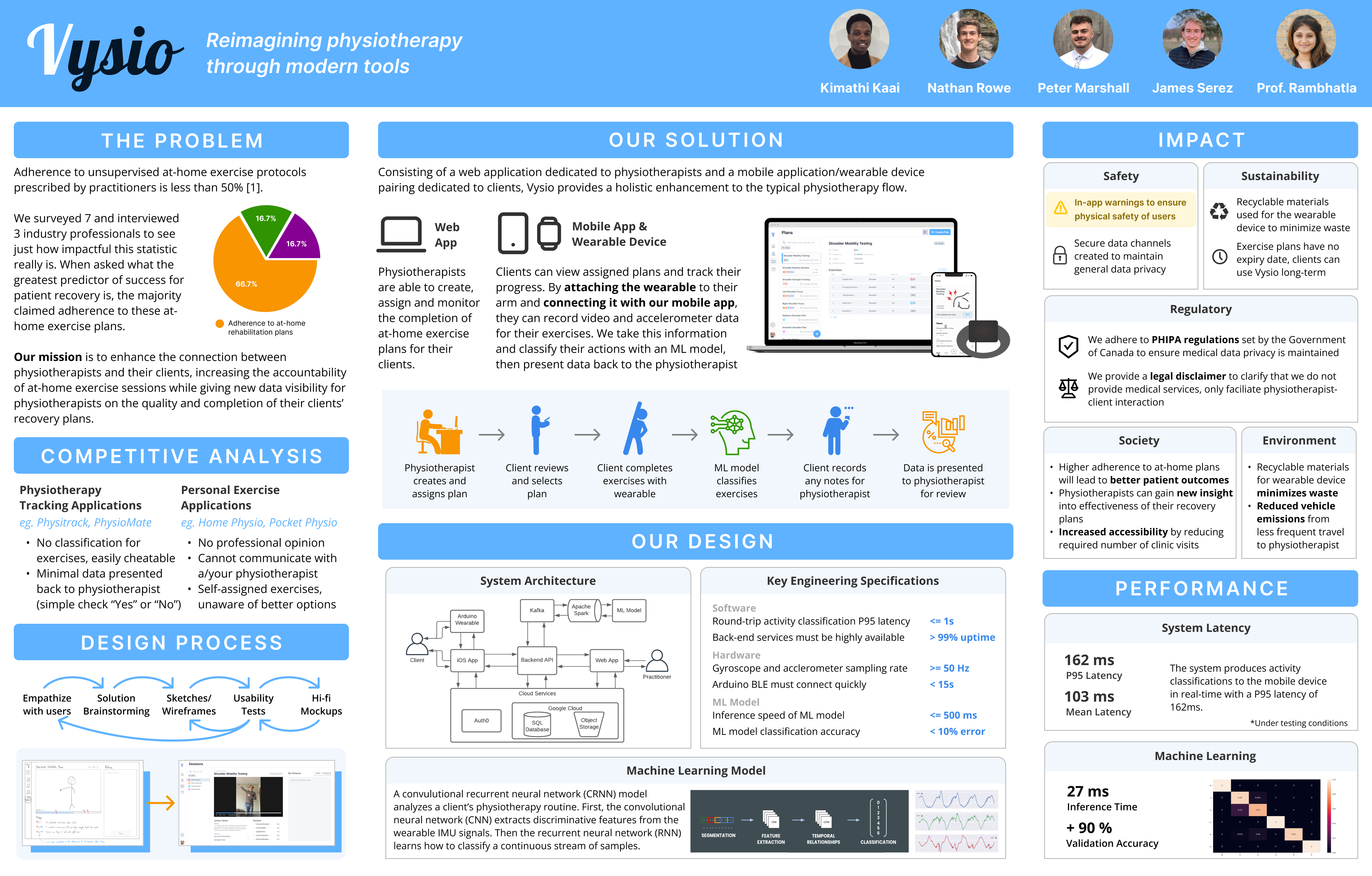
Check out the informational poster I created to summarize our project (click to enlarge), followed by a video I wrote, shot and edited!
Solution
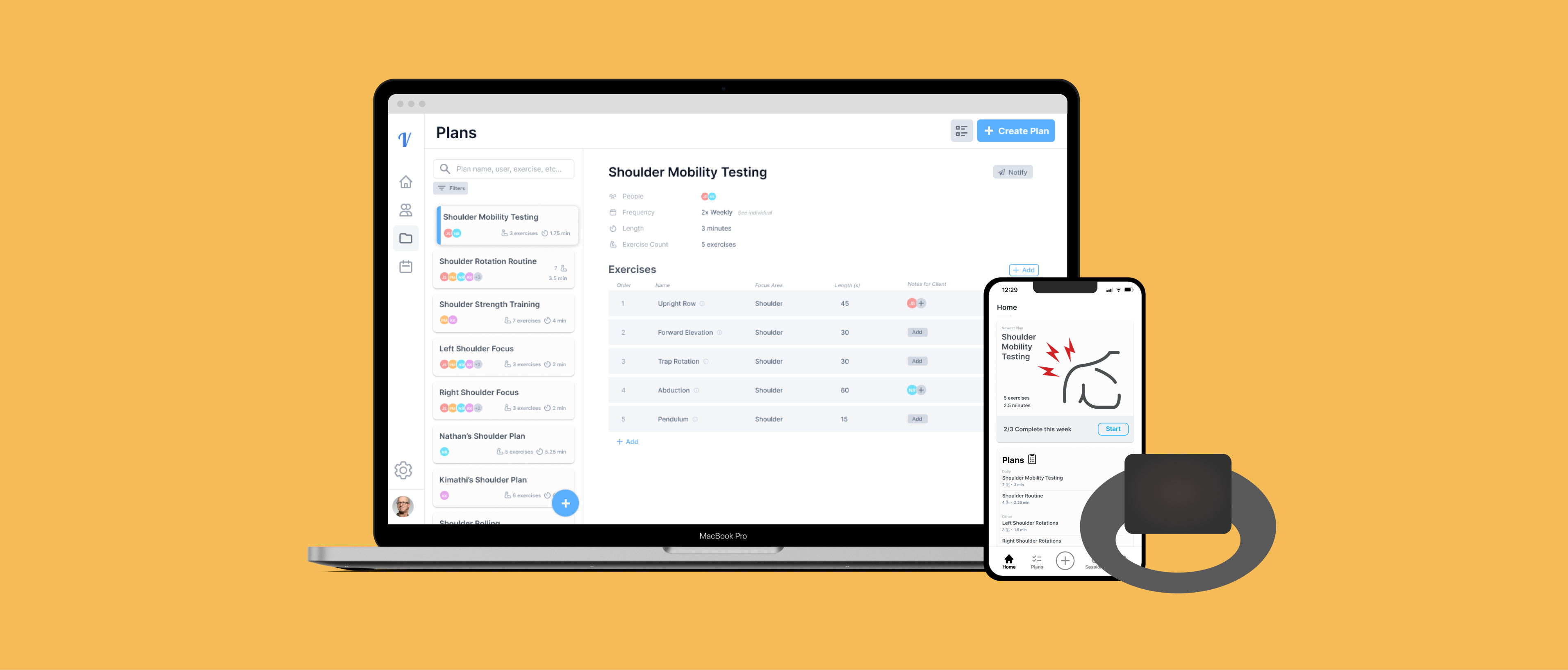
We made some extra work for ourselves by deciding our solution should consist of a web application, an iOS app and an Arduino wearable that feeds data into an ML model. Check out how users interact with these components:
For the practitioner
Web app to create, assign, and monitor the completion of at-home exercise plans.
For the client
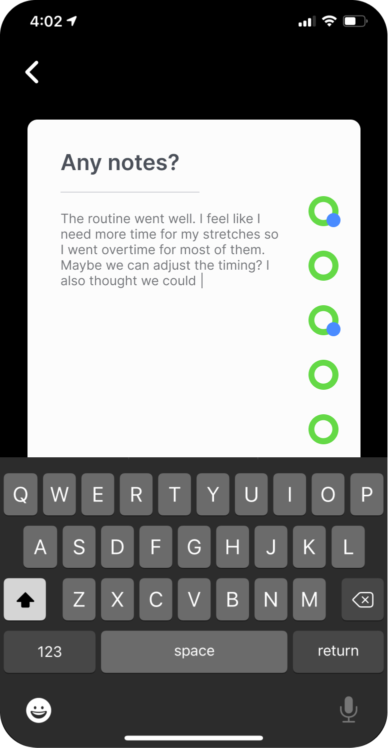
Mobile app to record their at-home exercise sessions and provide notes to their practitioner. Clients wear an arduino wearable so that their exercises can be recorded and classified.
WEB APPLICATION
Client Dashboard
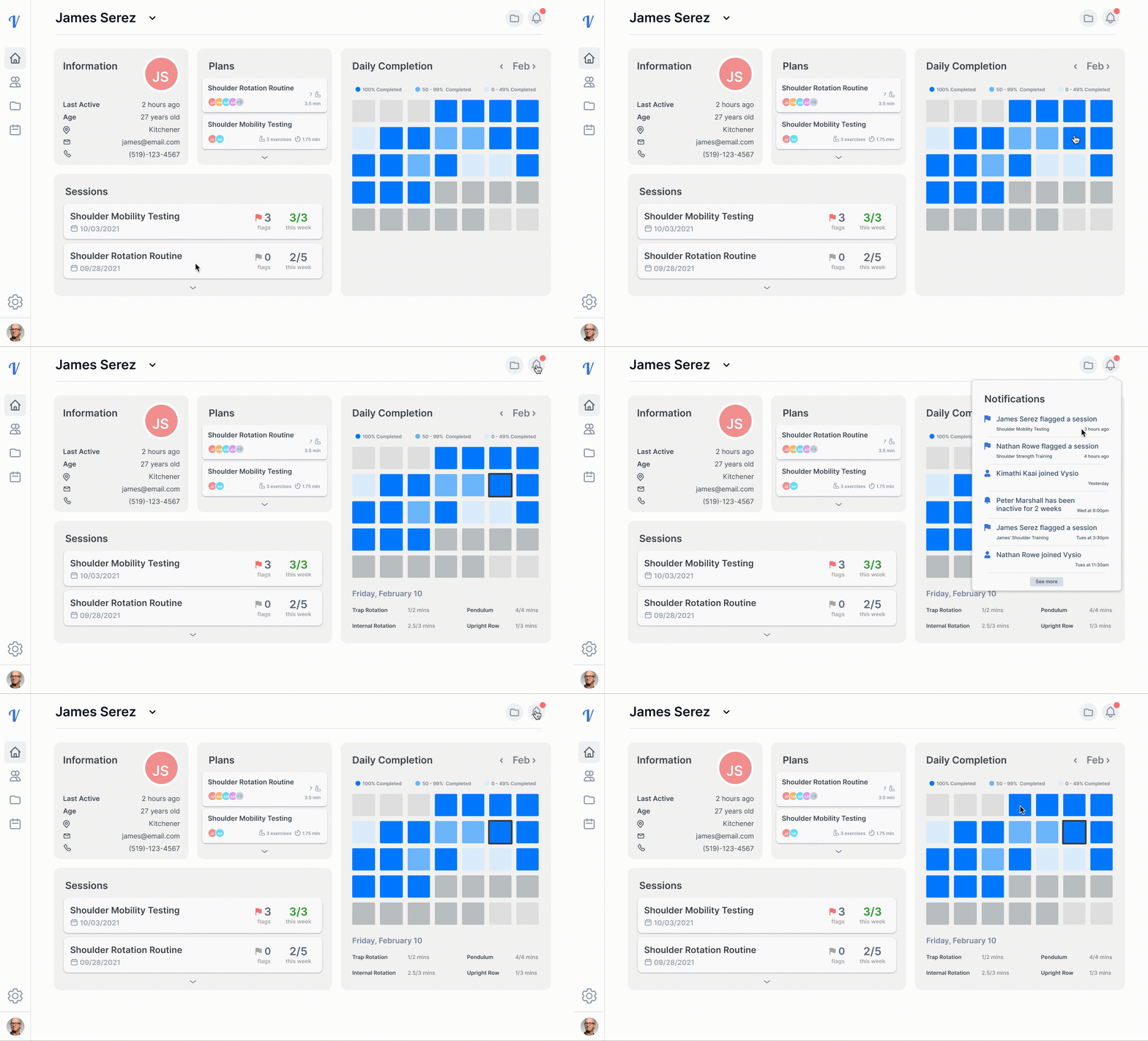
Working in partnership with local Physiotherapists, we identified a handful of key information that they might find valuable when reviewing their clients. This screen allows them to explore any exercise plans they’ve assigned, recent sessions the client has completed and a monthly heatmap showing their completion rate.
Plan Creation
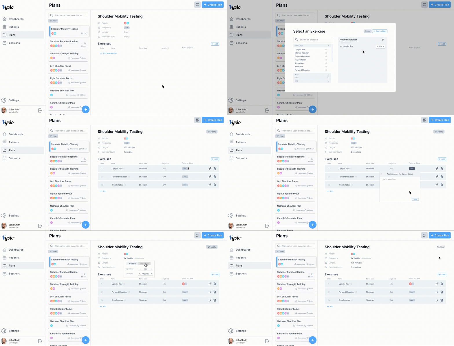
Here is where practitioners can create and assign exercise plans for their clients to complete throughout the week/month. I collected inspiration through existing physiotherapy, note-taking and data management applications. Practitioners can set the frequency for plans, custom-select a series of exercises and add individual notes.
Session Review
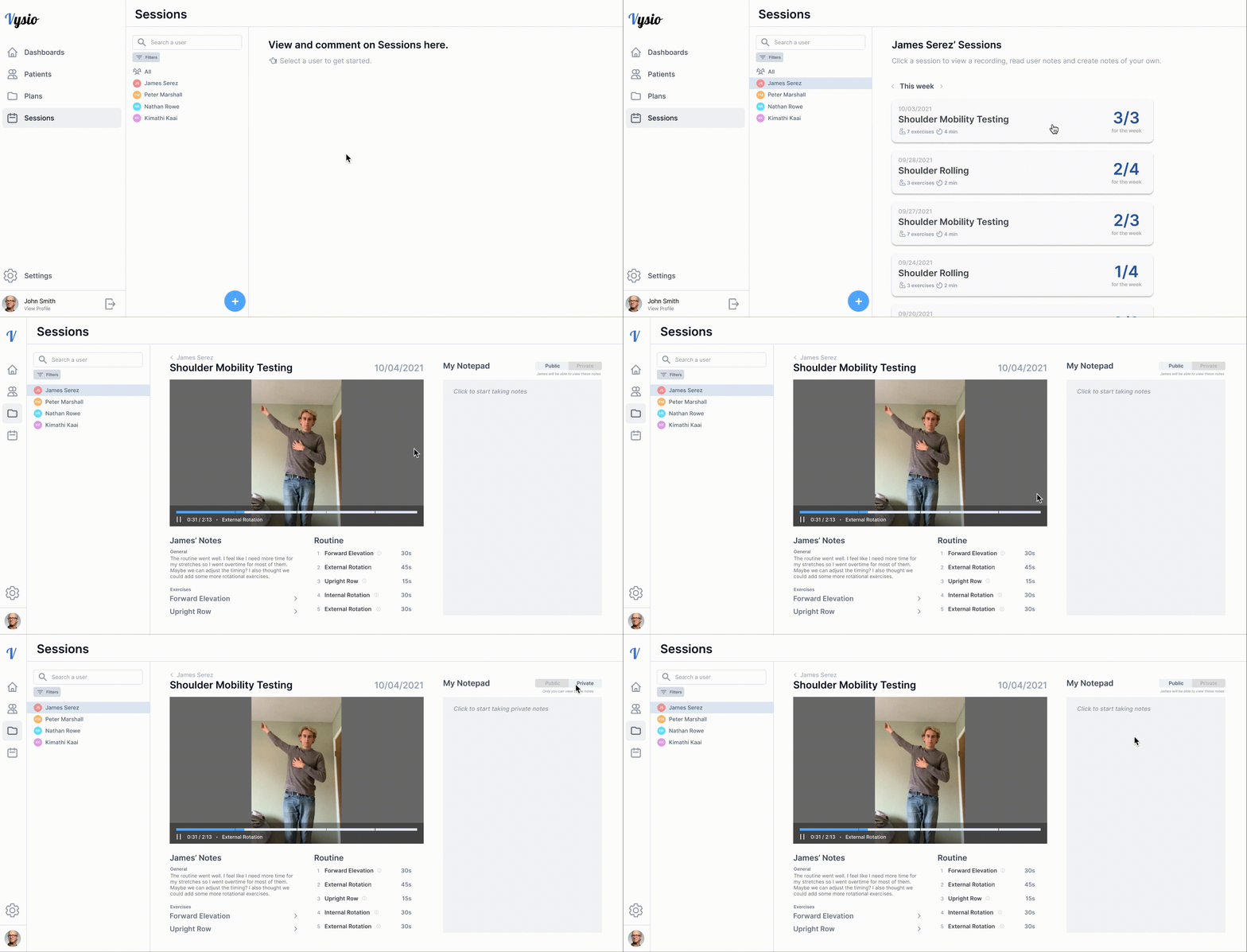
After clients complete an exercise session with our smartphone application and wearable device, the practitioner is then presented back with the data. They can review any notes recorded by the client and record both public and private notes of their own.
MOBILE APPLICATION
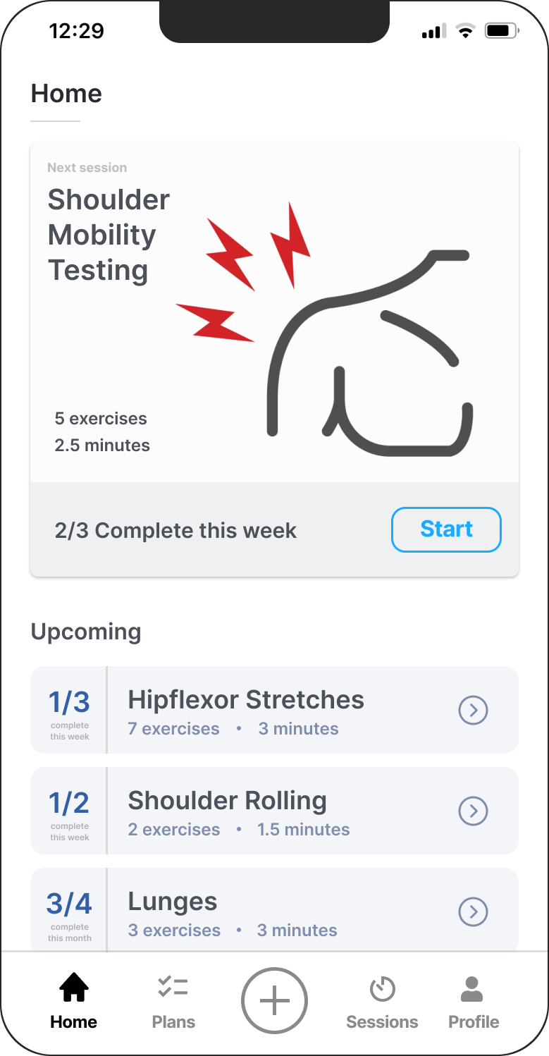
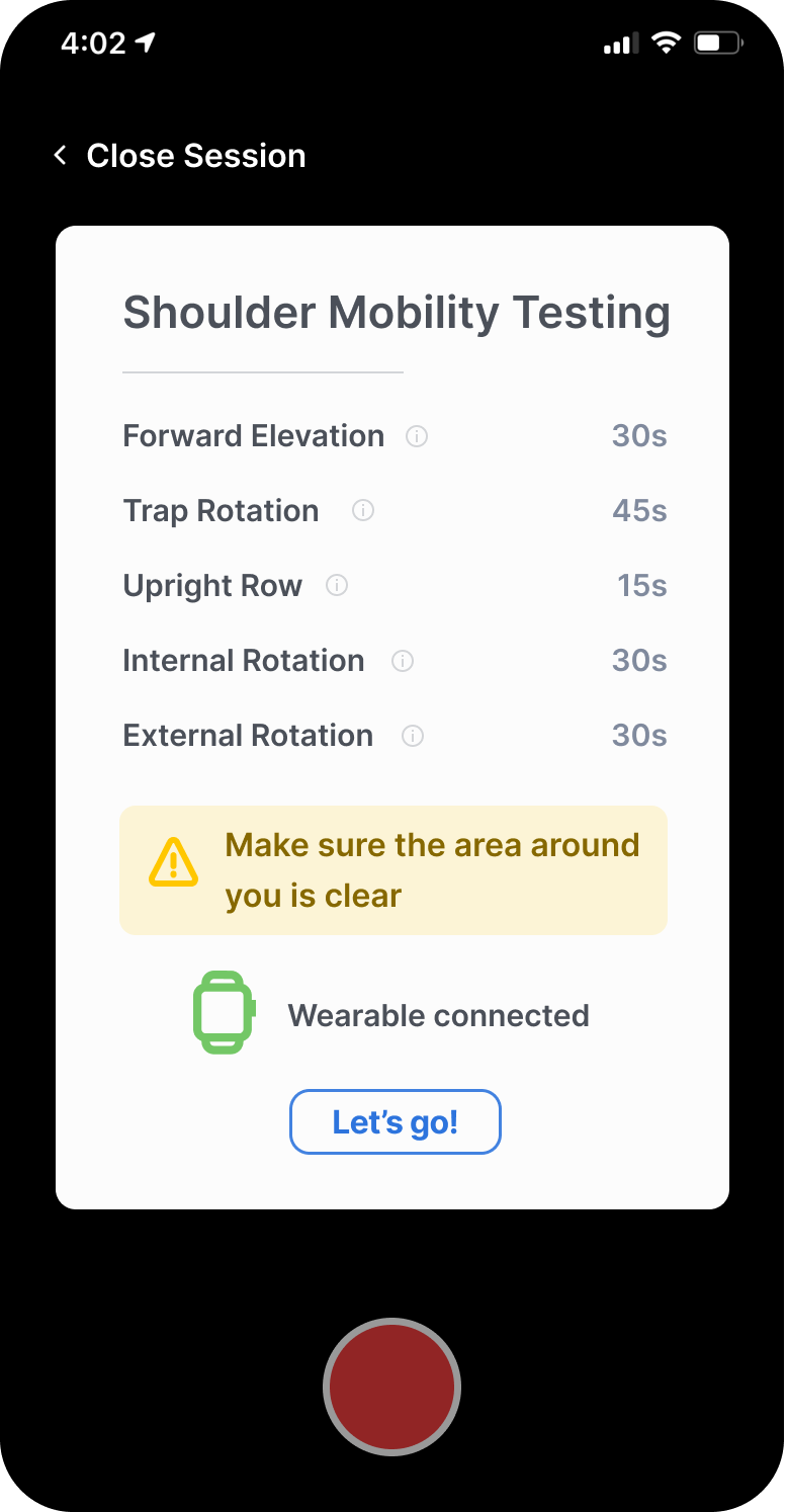
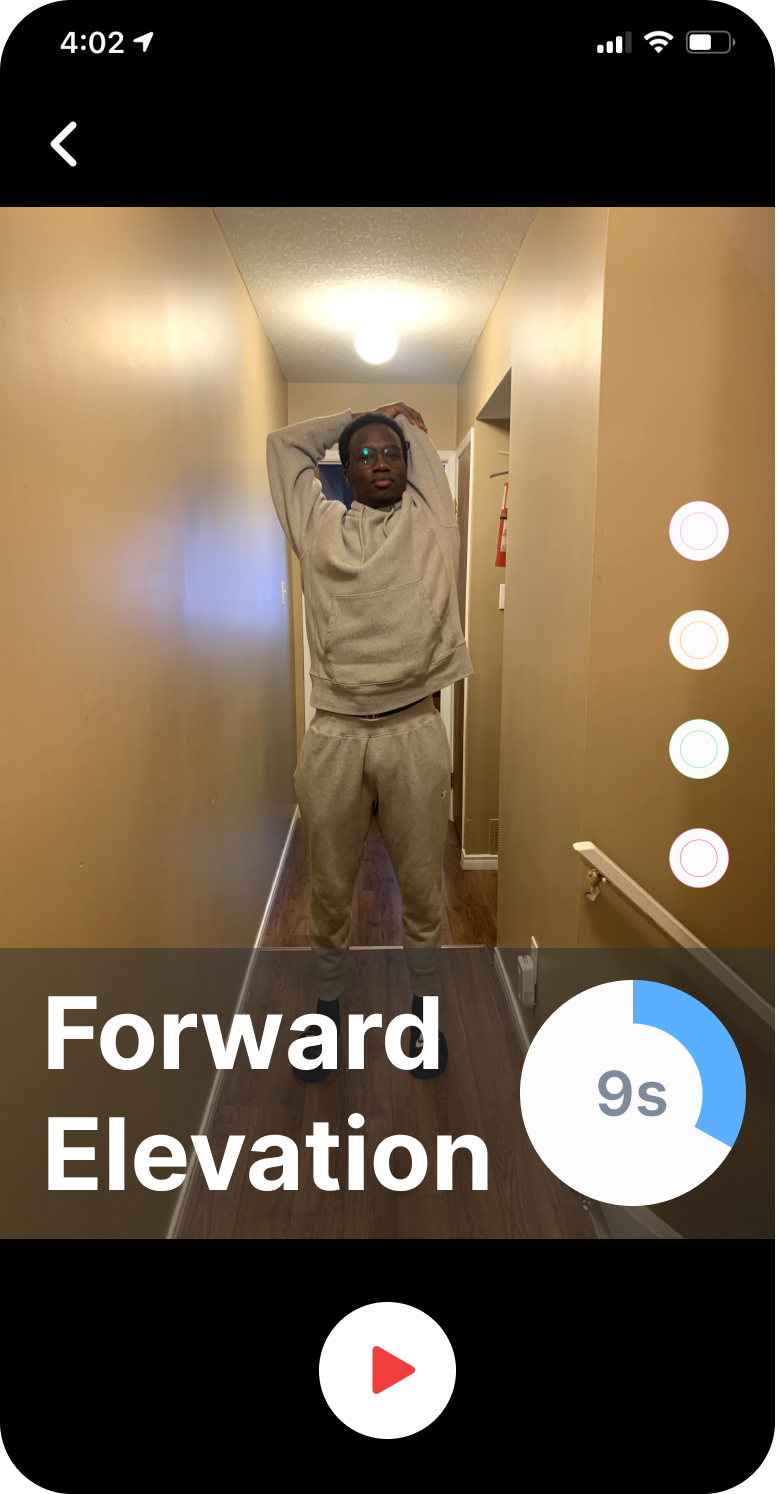
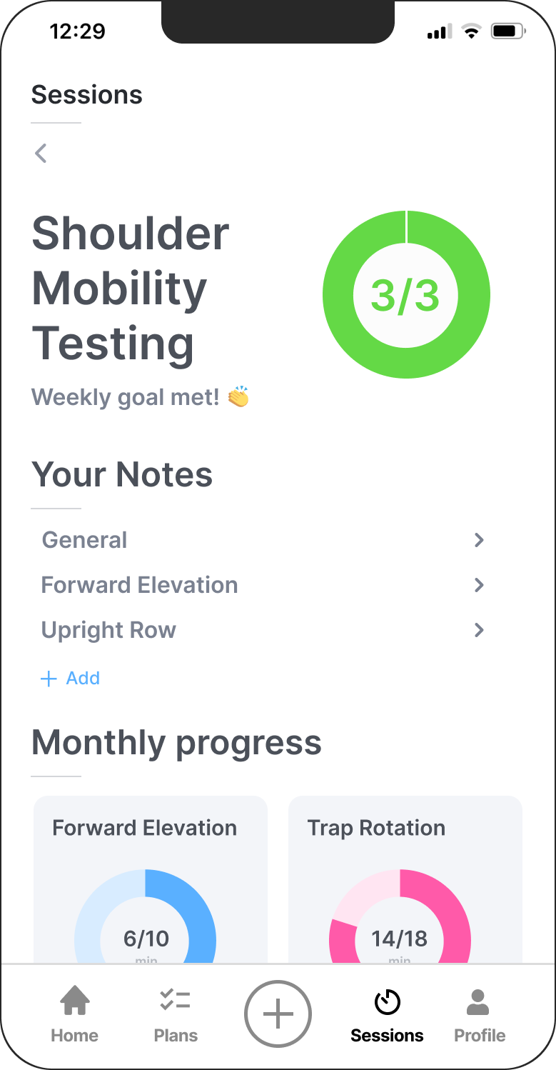
We designed and built a mobile application to accompany our web-app. Take a look at some screenshots demonstrating the flow from selecting an exercise routine to completing the routine to recording notes to reviewing your progress.
Design Process
I initiated and lead each stage of the design process for Vysio, pulling inspiration from course work, previous co-ops and online resources to determine our workflow.
BRAINSTORMING
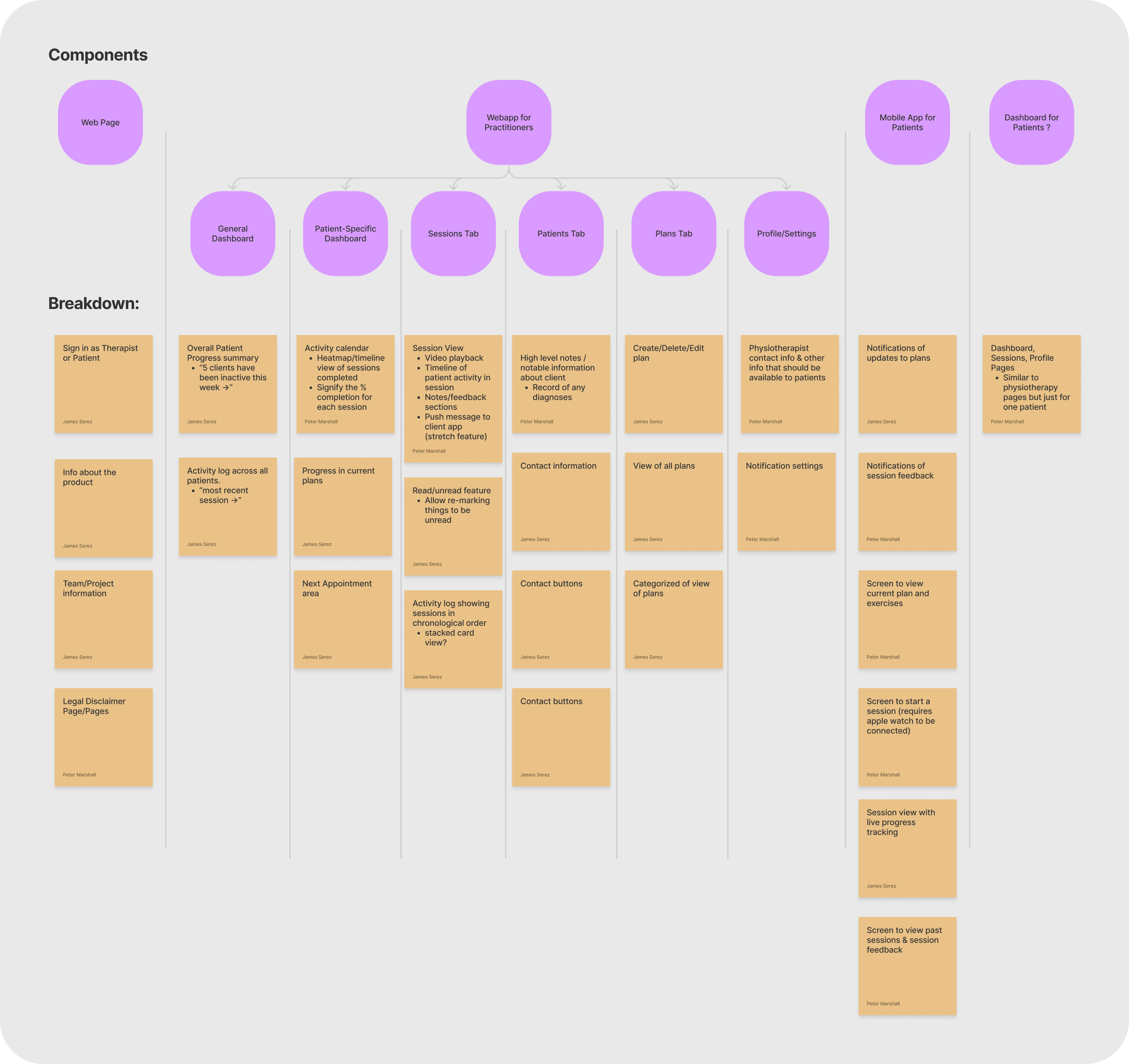
Purpose: to explore multiple design option and gain a high level view of the product we hope to produce. This is a key step in creating the architecture of a product.
Takeaway: the app will have be both web and mobile components. General content for different platforms explored and outlined.
Below is a screenshot of the brainstorming my team completed on FigJam. Click to see the image full size.
COMPETITIVE RESEARCH
Purpose: to gain inspiration from what's out there already. We're hoping to find ways people have solved smaller components of our problem already.
Takeaway: plenty of ideas for the dashboard, user lists, navigation and mobile components.
Take a look at a portion of some competitive research I completed. I tend to take a mood board approach, compiling similar screens and components together. Click to see the image full size.
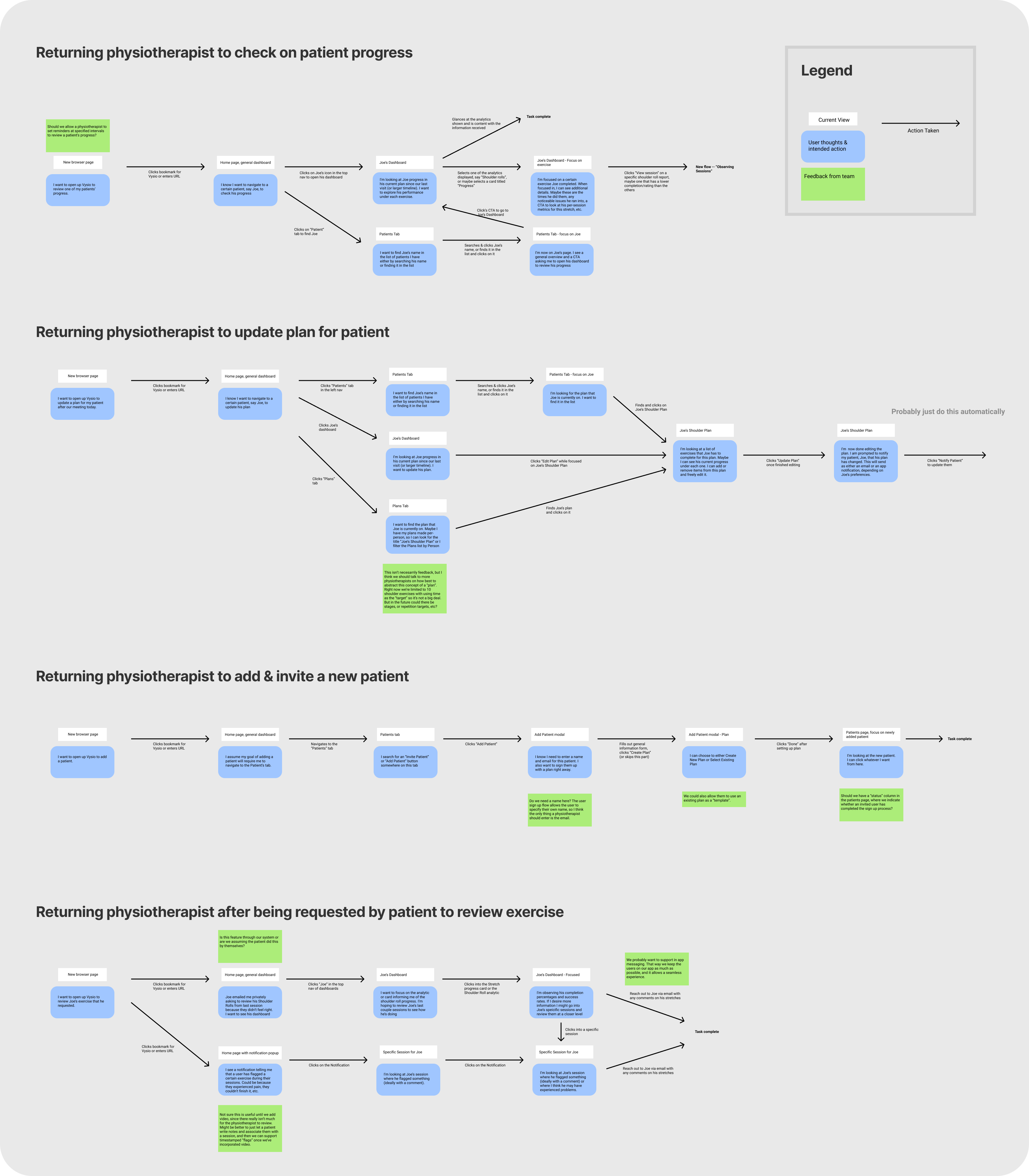
USER FLOWS
Purpose: to design an intuitive product that presents users with the correct information at the right time and minimizes steps to complete tasks.
Takeaway: helped us feel out the structure of our product further. Plenty of design choices were decided on:
- dedicated dashboards per user
- either Patients tab or Patient search bar to minimize work for web user
- use notifications to direct physiotherapists
- session view for physiotherapists to review specific sessions
- and many more!
Below is a snippet of some of the user flows I created. I built them in Figma then had my team review them. Click to see the image full size.
UI SKETCHES
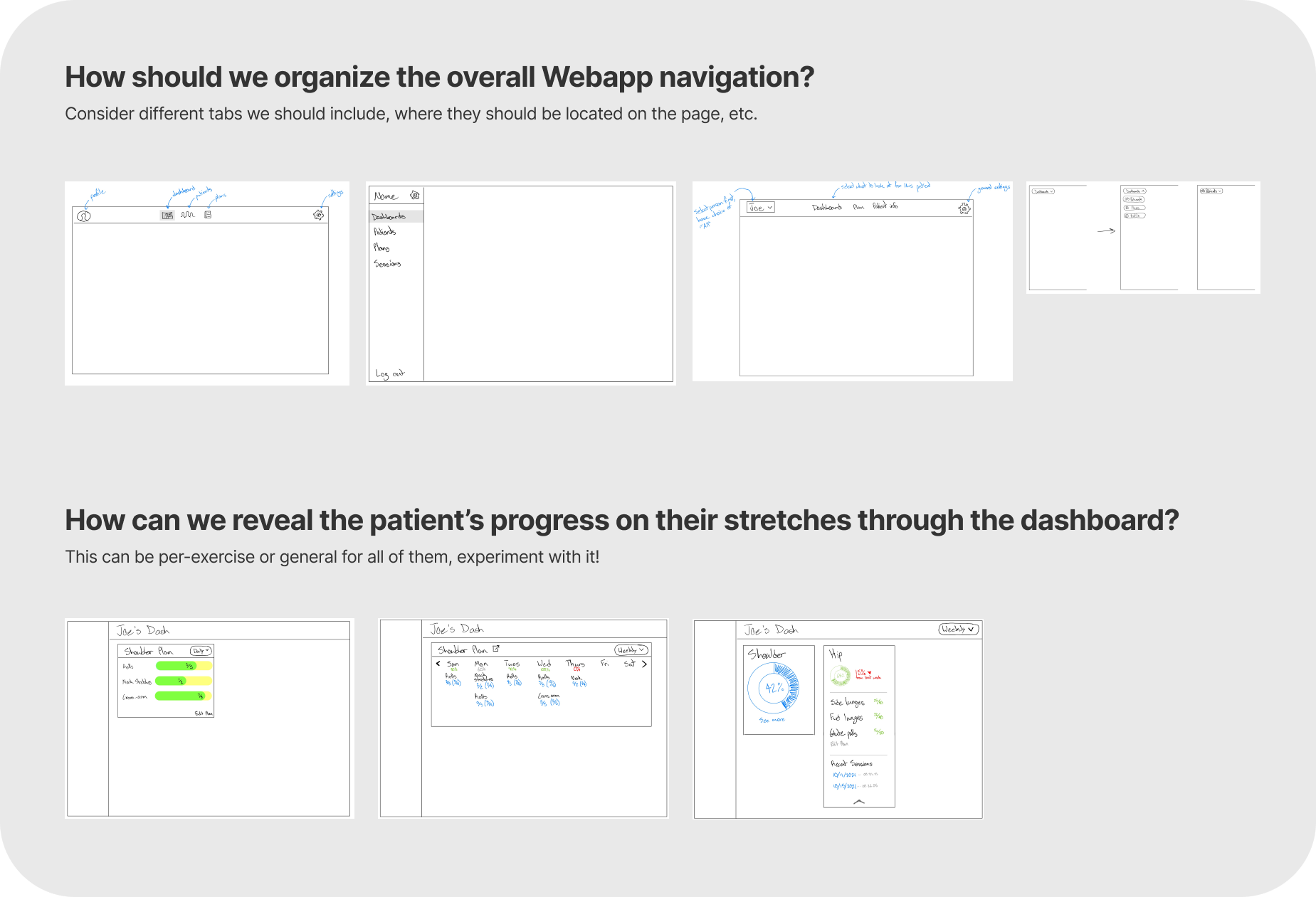
Purpose: rapid idea exploration. Now that we know our general application architecture, time to start brainstorming feature design. We challenged ourselves to do 3 designs per feature idea within 10 minutes to make sure we explored our options.
Takeaway: general UI design for select features.
Below is a look at some of my sketches for two different feature ideas. We explored 6 different features in total. Click to see the image full size.
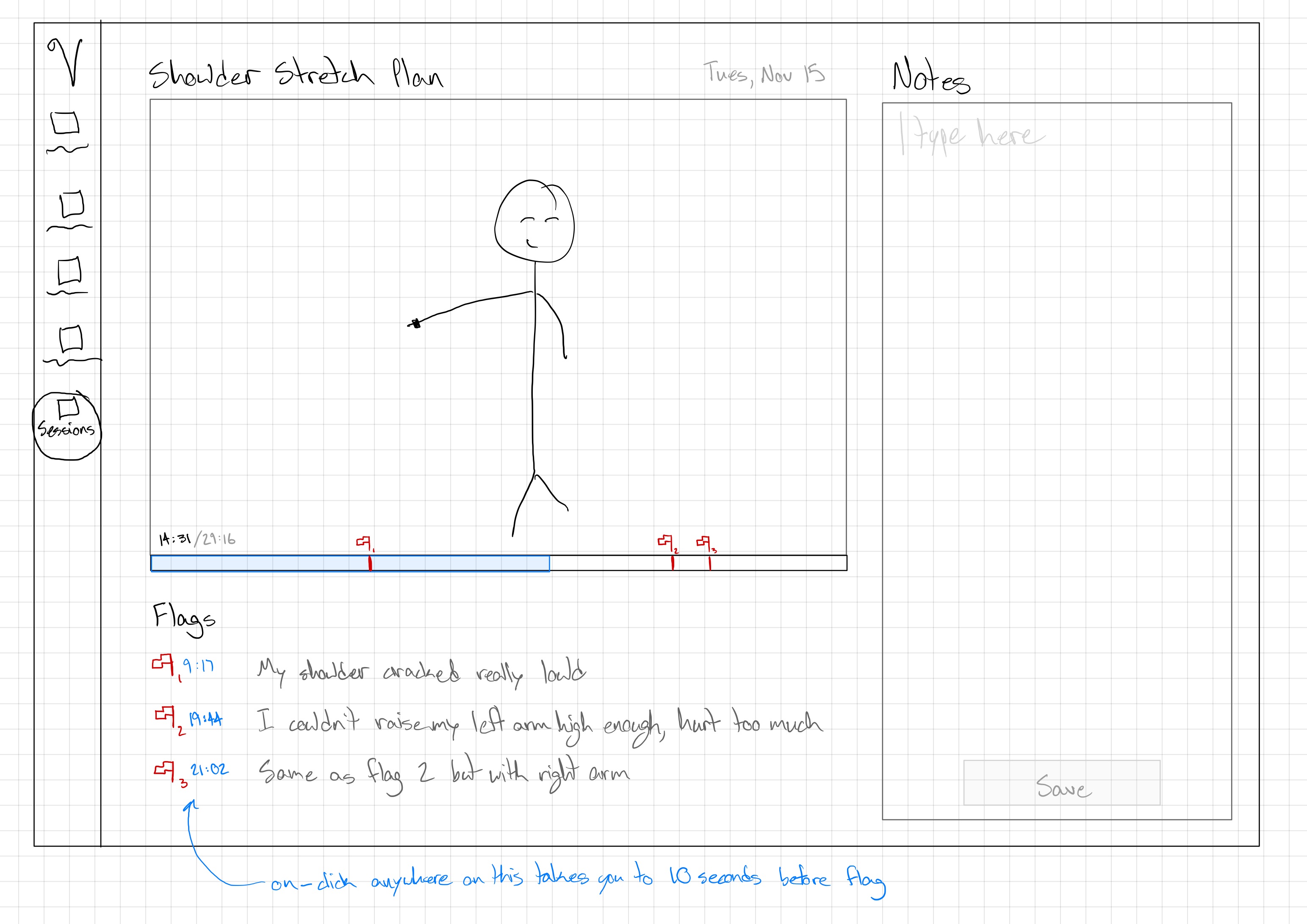
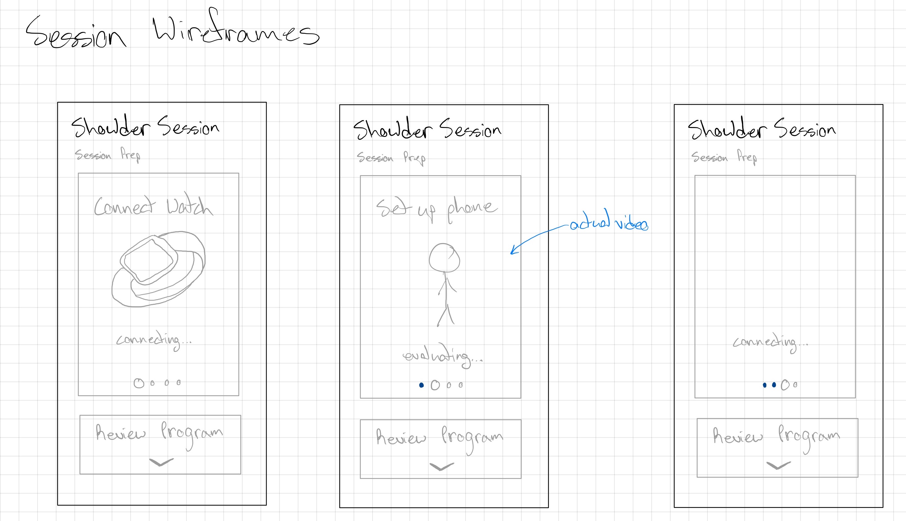
LOW FIDELITY MOCKUPS
Purpose: to quickly test out a handful of design ideas for different features & screens.
Takeaway: layout decisions made, feature structure decided upon.
Check out example lofi sketches I created for both the mobile and web applications (click either to see full image):
USER TESTING
Purpose: to empathize with my users and identify strengths and weaknesses in my solution.
Takeaway: layout decisions made, feature structure decided upon.
I performed user testing throughout the duration of this project. Sometimes it was live interviews over Zoom where I screen-shared my prototype, sometimes it was sending out screens of my solution with a questionnaire. I tested on industry professionals for the web app and physio attendees for mobile. Here is a snippet of my testing script for the final prototype:
TESTING RESULTS
Purpose: to convert both user and stakeholder feedback into actionable items to advance our solution.
Takeaway: outlined in the image below, we learned out dashboard was pretty useless and that notifications were required if we wanted physiotherapists to even open the app.
I prepared this graphic below as part of a proposal to my group for where we should dedicate our development effort:
Project Management
Without any boss or manager, any and all project management was left to us. We selected Notion as our base for all information management and progress tracking.
JOB BOARD
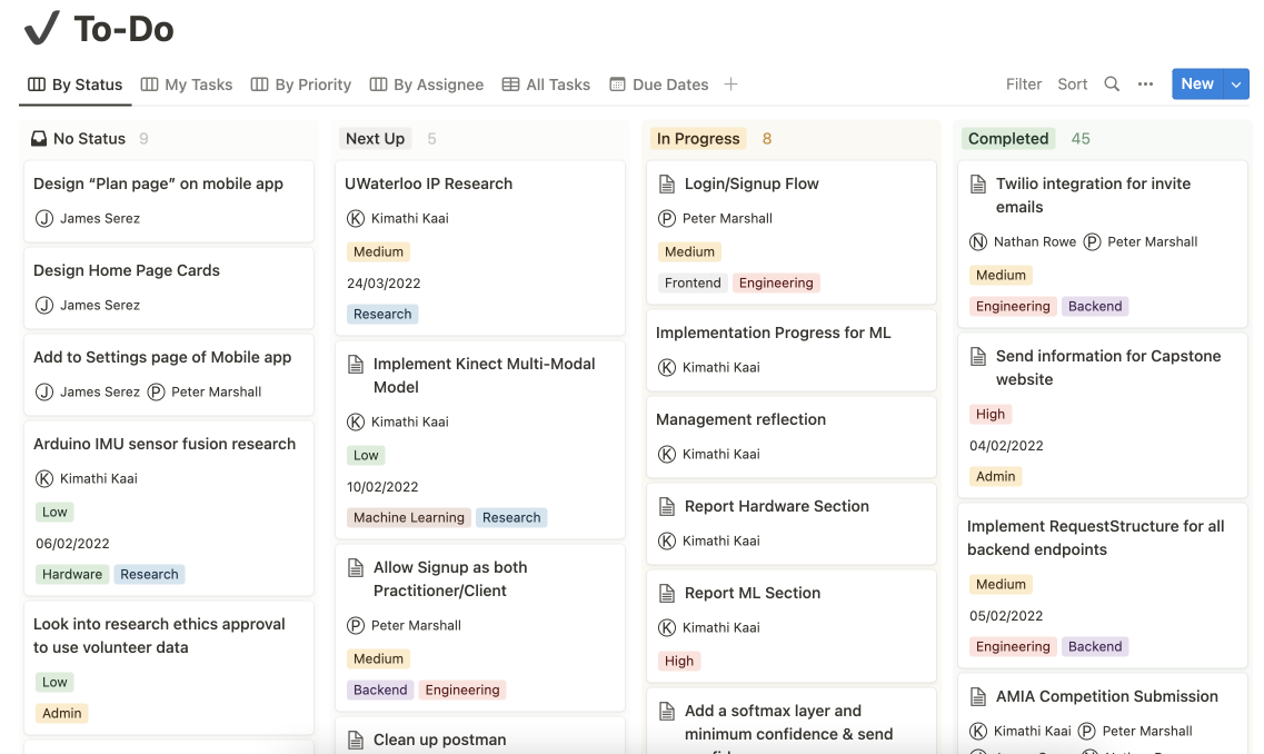
I crafted this job board within Notion to help track our progress. Tickets would be created, categorized based on priority and type, and assigned to individuals. We found this incredibly helpful for monitoring our workflow and effectively allocating development resources.
WEEKLY SYNC-UPS
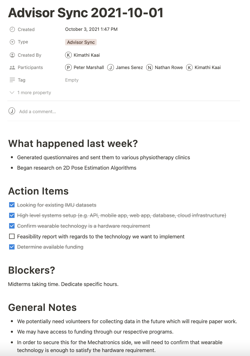
We scheduled weekly meetings with our advisor for the project, as well as group meetings 3 times a week. Touching base often prevents delays from blockers and helped us keep the project moving forward. Notice above how each meeting we'd discuss blockers and action items.