

Purolator Support Desk
This project is a self-initiated, custom designed and custom built prototype to fuel a full ground-up rebuild of Purolator’s Support Desk system.
Team
UI/UX Designer (me) Software Developer (still me) 2 Supporting Engineers VP of Product
Role
UX Research Interaction Design Software Engineering Prototyping
Tools
Figma, HTML, CSS, JavaScript
Duration
May 2019 - July 2019
Timeline


Process
01.
Identify the problem space
02.
Evaluate the current solution
03.
Design an improved solution
04.
Build a prototype
01.
Identify the problem space
Within my first week at Purolator, I decided I really didn’t like their current support desk. I’ll get more into my proper analysis of it in the next section, but a few short experiences with it trying to learn about key shipping terms and I realized their solution was insufficient. Here’s a sneak peak of what it was looking like:
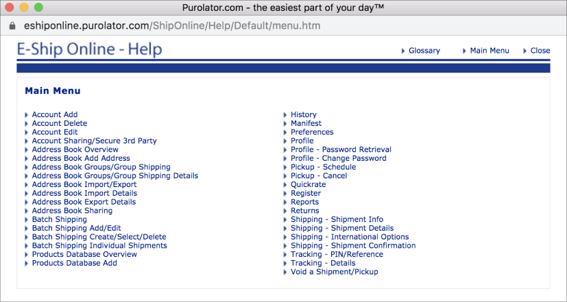
You see what I mean? Purolator was on a mission to modernize their company and I knew this would have to be one of the first things to go. I began defining the project before proposing it to my manager.
REQUIREMENTS
To make my case to my manager to take on this project, I created some requirements and constraints to demonstrate its reality and importance. Practice from previous co-ops and knowledge from my degree helped me craft these.
User Interface
Layout, sizing, styling and architecture all must be assessed and reconstructed accordingly to meet modern design standards and user expectations.
User Experience
The journey the user takes to seek out desired information must be more efficient, attractive and effective to relieve support staff and retain users.
CONSTRAINTS
At the time of this project I had pretty little knowledge of web development, so initial technical restraints were quite limited. Here are two relatively straightforward constraints I came up with before diving into the project.
Complexity
To satisfy the user’s need for quick information, the new support desk must load efficiently. Animations and aesthetic upgrades should be limited accordingly.
Design System
Colouring must abide by the previously defined Purolator design system.
Purolator Red #F00000
Purolator Blue #001996
I scheduled a meeting with my manager, proposed the project titled “ESO Support Desk Redesign”, and had it approved! Now came a proper assessment of the current solution.
02.
Evaluate the current solution
I completed a heuristic evaluation of Purolator’s support desk. This means to evaluate the solution against a set of design principles, including Norman’s Principles of Good Design (NPD), the 7 Principles of Universal Design (PUD), and Nielsen’s 10 Usability Heuristics (NUH).
TOO MANY CHOICES
The user is presented with far too many options here. Without even considering the poor UI that makes it hard to distinguish between them, the sheer quantity of options completely halts the user in their search for information. This had to change.
NAVIGATION
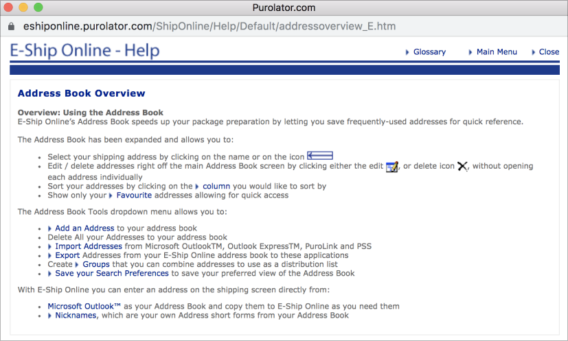
Aside from the very small text with minimal line spacing, a few more problems were found within the articles themselves. Potentially the biggest problem was navigation. After completing some internal testing, I found that most users clicked “Close” to navigate back to the Main Menu of articles, but instead it would close the entire support window. Navigation was going to need a serious rework.
SUMMARY
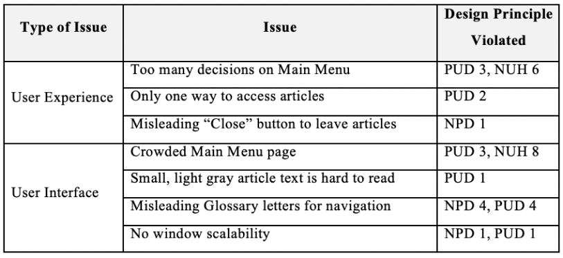
The table above summarizes the ways in which the current Support Desk violates standard design principles. These flaws would be the focus of my redesign.
03.
Design an improved solution
NEW ARCHITECTURE
Through simple observation of the current solution, I realized the support desk could gain greatly from sorting articles into buckets. Groups of articles shared common themes, such as Profile- or Address Book-related articles. I came up with the 9 following categories:
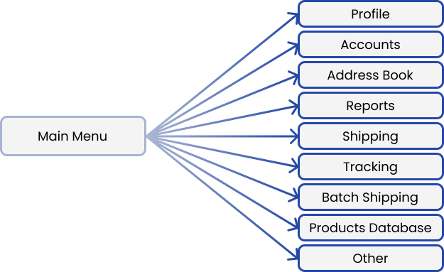
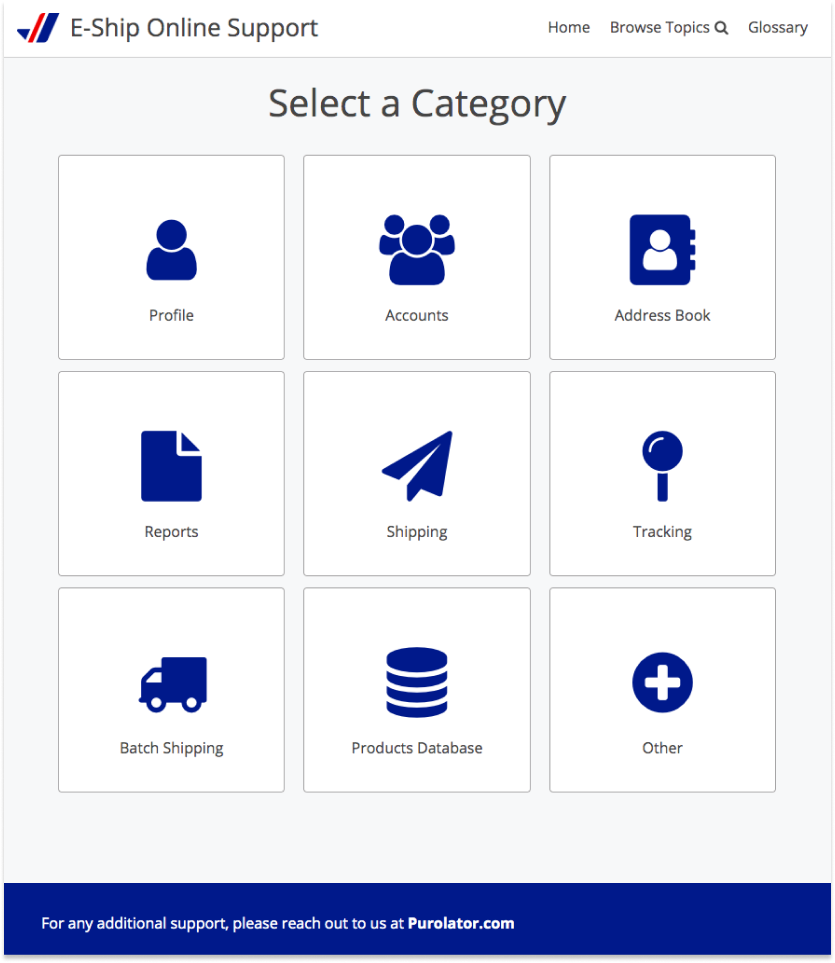
By creating these 9 general categories, I hoped that I could streamline the user’s experience and ease the problem of having to decide between too many options.
TOOLKIT SELECTION
Figma
It’s been my primary platform for design work in the past, it’s highly accessible, and it allows for easy collaboration.
Bootstrap Responsive Framework
I needed something simple, straightforward and responsive to build my prototype. I also wanted to ensure both Web and Mobile needs would be met.
COMPETITIVE RESEARCH
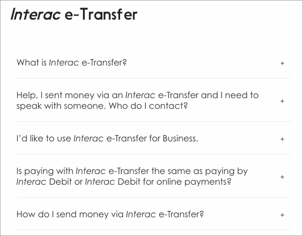
Always a necessary step in my design process! Sometimes you don’t need to invent the wheel, you just need to build the best wheel. I explored a few different platforms, one of which was Interac’s website. I loved their expand-condense method to relay information:
LOW-FIDELITY MOCKUPS
To allow for quick iteration and exploration, I started building some low-fidelity mockups in Figma. I would frequently present my mockups to developers and product owners within the company to get their opinion. As I continued to iterate, I landed on these designs:
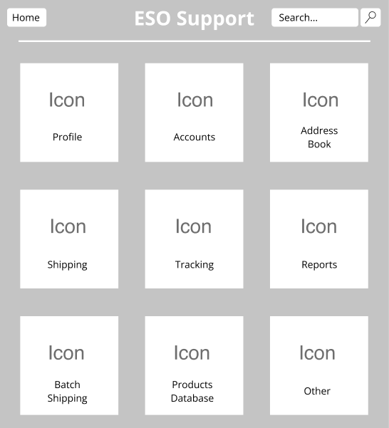
Cards: Competitive research taught me that cards are trendy and effective. Icons, when used correctly, are an effective way for users to quickly identify what each category entails.
Search Bar: I also included a search bar at the top since one of the most frequent pieces of feedback from user testing was that a support desk needs a search bar.
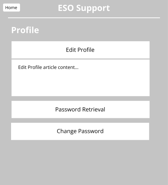
Font size: Larger text! The previous solution had small, bold text that very poor visibility.
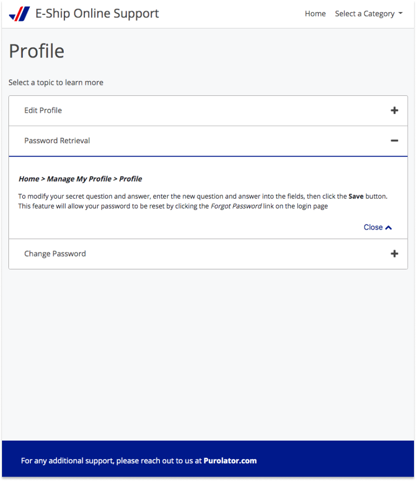
Expandable articles: Now that multiple articles are contained in each category, I knew the users would want an efficient way to flip between them. Each articles is easily expanded and condensed based on the needs of the user.
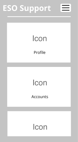
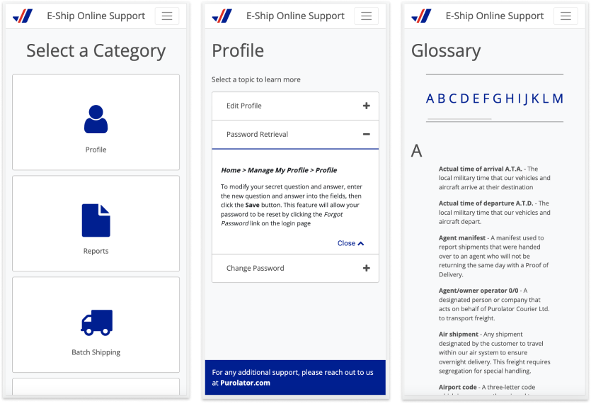
Mobile build: For quick info, users often turn to their phones. Our support desk should be mobile friendly so that users can access information as fast as possible.
MEDUIM-FIDELITY COLOURING TEST
Since my main goal was to create a proof of concept, it didn't make sense to put hours and hours into developing high fidelity mockups of my prototype. If my prototype were approved, then would begin the fine-tuning to match Purolator’s new feel.
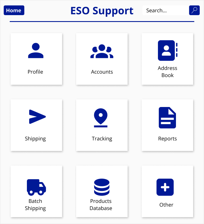
However, I did want to get a clear idea of how I would style my prototype. I whipped up some medium fidelity designs to test colours, shadowing and iconography. Here’s a sample:
04.
Build the prototype
OVERVIEW
Objective
To develop a functional prototype that enhances the user experience of Purolator’s support desk. If approved, this prototype will be transferred to the development team as a model for the support desk rebuild.
Tech Stack
HTML
CSS3
JavaScript
Bootstrap Framework
Validation
Success will be determined via internal user testing. Users will be asked to complete short tasks on each platform, qualitative comparisons will be recorded.
NAVBAR
The heuristic evaluation discussed in section 2 revealed that the navigation of the support desk desperately needed to be updated.
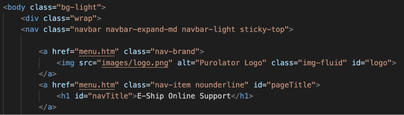
Above is a snippet of the code I wrote to structure the navbar shown below. Bootstrap made development efficient and ensured responsive design when switching between mobile and web.

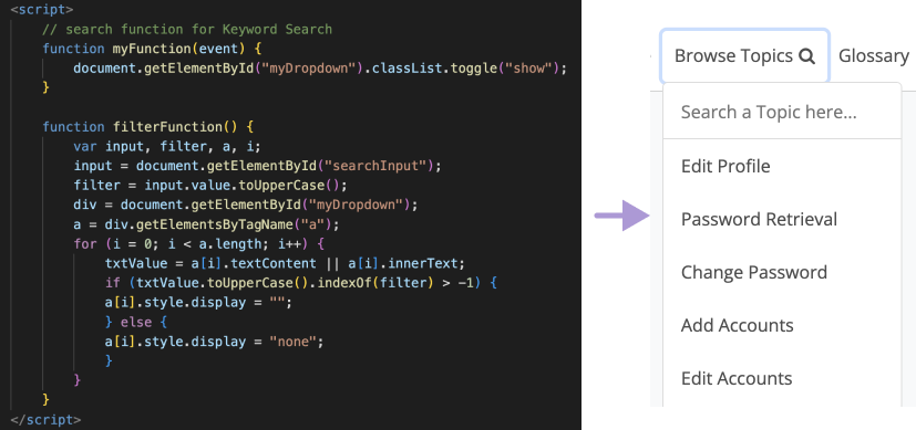
SEARCH FUNCTION
Users needed the ability to search. One doesn’t typically enter a support desk to browse, but instead find very specific information that they need as soon as possible. With a search bar, I hoped to streamline the user experience.
HOME PAGE
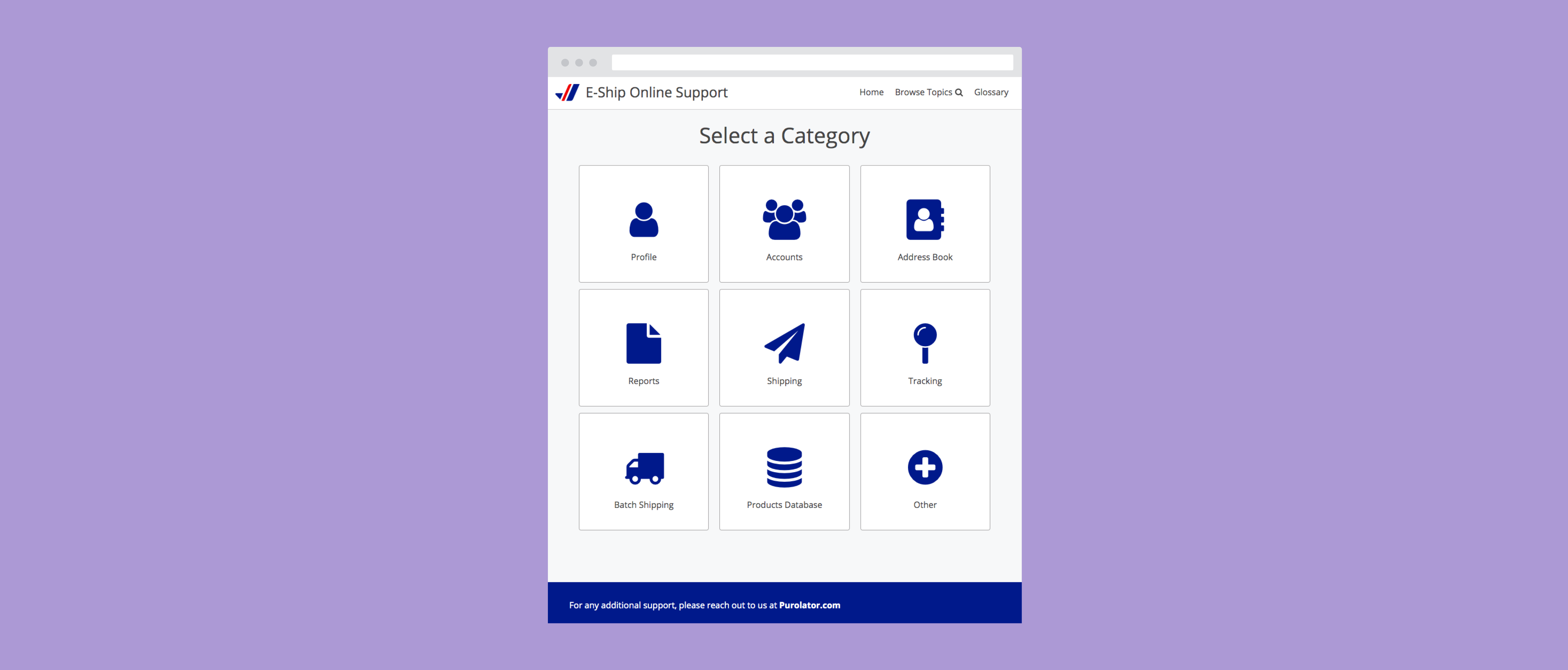
Now with cards, large icons and categories, the home page has been revamped to ease the decision process for the user. What was once 30+ tiny text titles is now 9, large, easily distinguishable options. I’ll spare sharing the code in this article, but here’s an image of the final build:
ARTICLES
Within the category, a user can click to expand individual articles. Pulling from competitive research, this layout is efficient and intuitive. I added the option for quick navigation between different categories in the navbar to reduce clicks from the user. Here’s what I created:
MOBILE
Bootstrap’s responsive nature was helpful, but it still took some fine-tuning to finish up the mobile builds. Industry standard UI elements were used, such as the hamburger menu in navbar.
VALIDATION
Internal testing was completed with 3 software developers, a fellow co-op, a product owners, and the director of product at Purolator. Qualitative observations all highlighted that the redesign was more efficient, attractive and effective. Support articles were found faster, UI approvals were much higher, and users didn’t get confused in the process.
Appx.
Comparison with Purolator's current support desk
The prototype was approved by the director of product. I handed off my prototype at the end of my co-op term. A few months later, I checked back on Purolator’s live site and was pleasantly surprised to see their support section was modeled off my prototype.
HOME PAGE
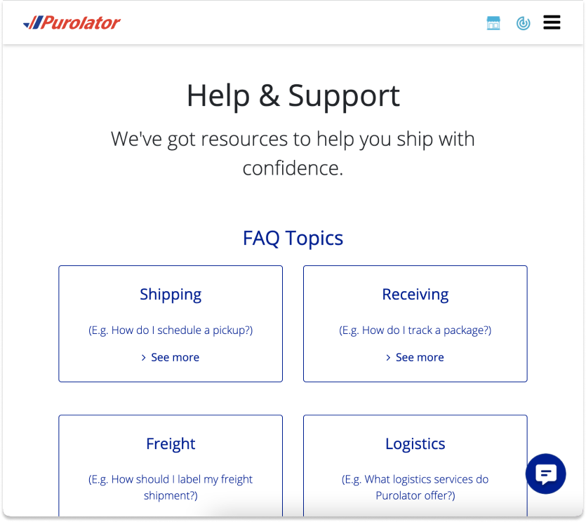
Observe the large cards, Purolator Blue text, and a few select categories.
ARTICLES
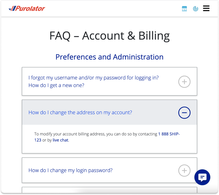
Observe the stacked articles and click-to-expand functionality with plus/minus icons.
MOBILE
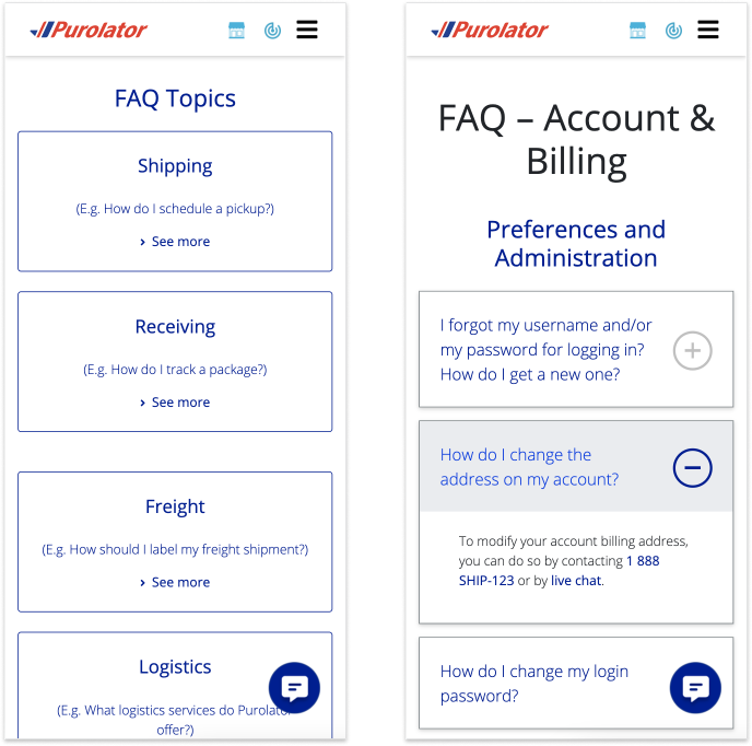
Myself and my team were very pleased with the prototype I developed. This task was the perfect chance to stretch myself not just in terms of problem solving, but problem identifying as well. Feel free to connect with me if you have any questions about my work!