Manulife Developer Site
developer.manulife.ca is Manulife's first engineering outreach web platform, aiming to generate awareness about engineering at Manulife. The site was launched in July 2020. I drove product strategy, design, and refinement for this project.
Team
2 UX Design Co-ops 2 UI/UX Design Mentors Product Owner Marketing Officer 3 Web Developers
Role
Needs Analysis Architecture Design Interaction Design Product Thinking
Tools
Sketch, Figma, Axure, HTML
Duration
January 2020 - April 2020
Process
01.
Understand the problem space
02.
Develop a strategy
03.
Design a solution
01.
Understand the problem space
BACKGROUND
Problem
Post-secondary students avoid applying for Manulife’s internship/co-op program and full-time positions due to the image they have of the ‘old’ Manulife.
Goal
The site should provide the necessary information about the technology and culture that exists in the Engineering departments at Manulife. This will be done with the hopes of having a more positive influence on potential co-op studnets or new grads who are deciding whether Manulife will be the next stop in their careers.
STAKEHOLDER OBJECTIVES
1.
Solution must attract new and young talent by revealing how Manulife is keeping up with technology trends.
2.
Solution must be low maintenance. The site will be low priority in terms of development effort.
3.
Solution should display content in a way that is easy to understand at a glance. We wish to minimize the amount of page jumping users must perform to get the information they came for.
PRIMARY RESEARCH
When I arrived at Manulife, the problem I’d be working to solve was already defined for me by the product owner and some AVPs. My first goal was to understand the problem space better and validate it however I could.
We generated and sent a survey out to 38 designers and developers of various skill levels to better understand who we are designing for. We also conducted 5 in-person interviews to gain further insight into the current perspective our target users have of tech jobs at financial companies. Here’s a summary that we presented to stakeholders:
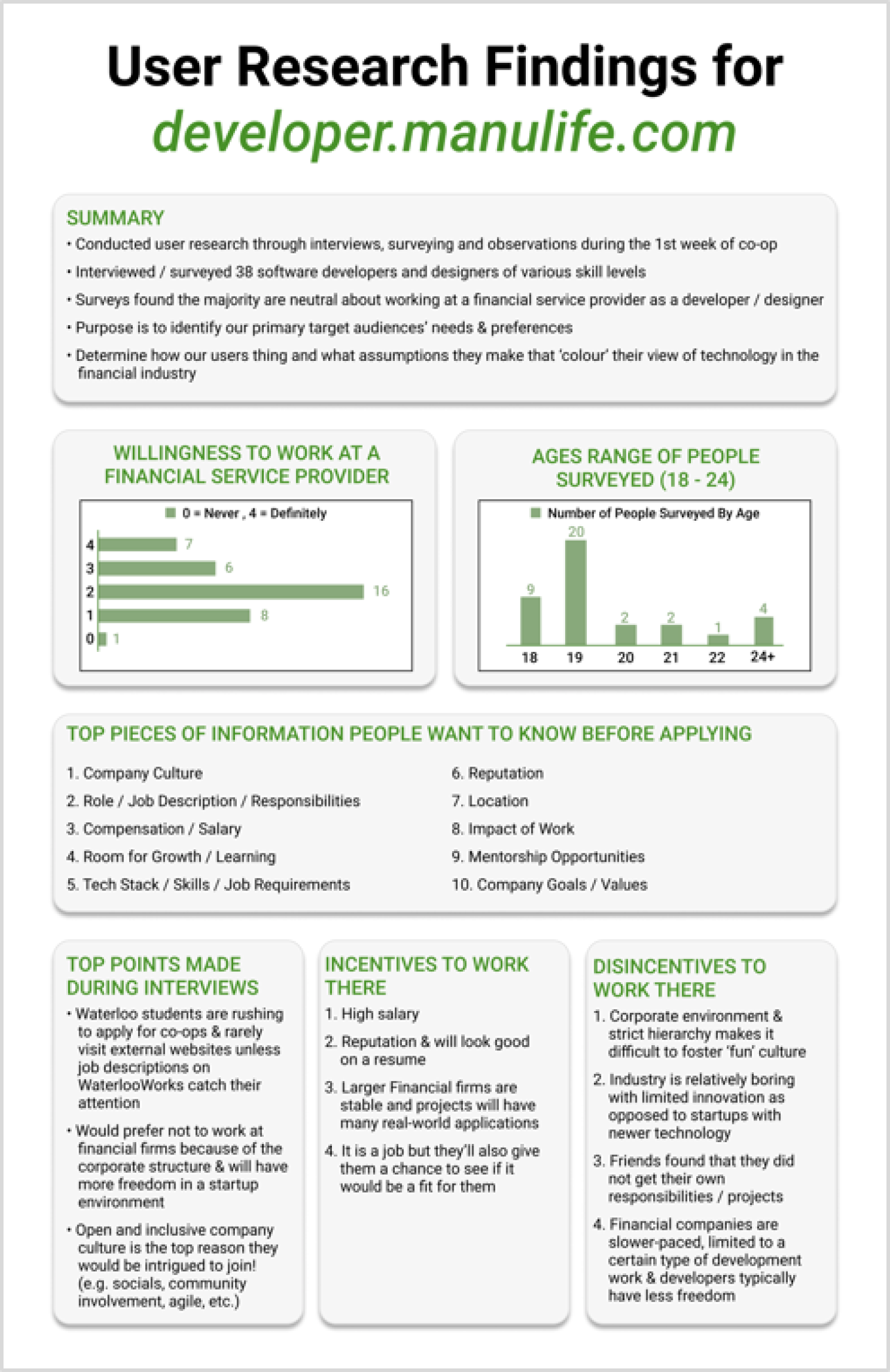
I was able to pinpoint the top 3 reasons why users don’t apply to engineering positions at companies in the financial industry:
1. Lack of innovation/inflexible 2. Boring 3. Corporate Environment
These will be helpful in identifying where we can stand out in the industry with how we communicate to our users.
ANALYZING CURRENT USER INTERACTIONS
I decided to investigate the current flow users would take to apply for an internship at Manulife, given that it’ll be a primary function of our solution. From the flow walkthrough and user interviews completed earlier, myself and the fellow co-op identified 3 key pain points users are facing:
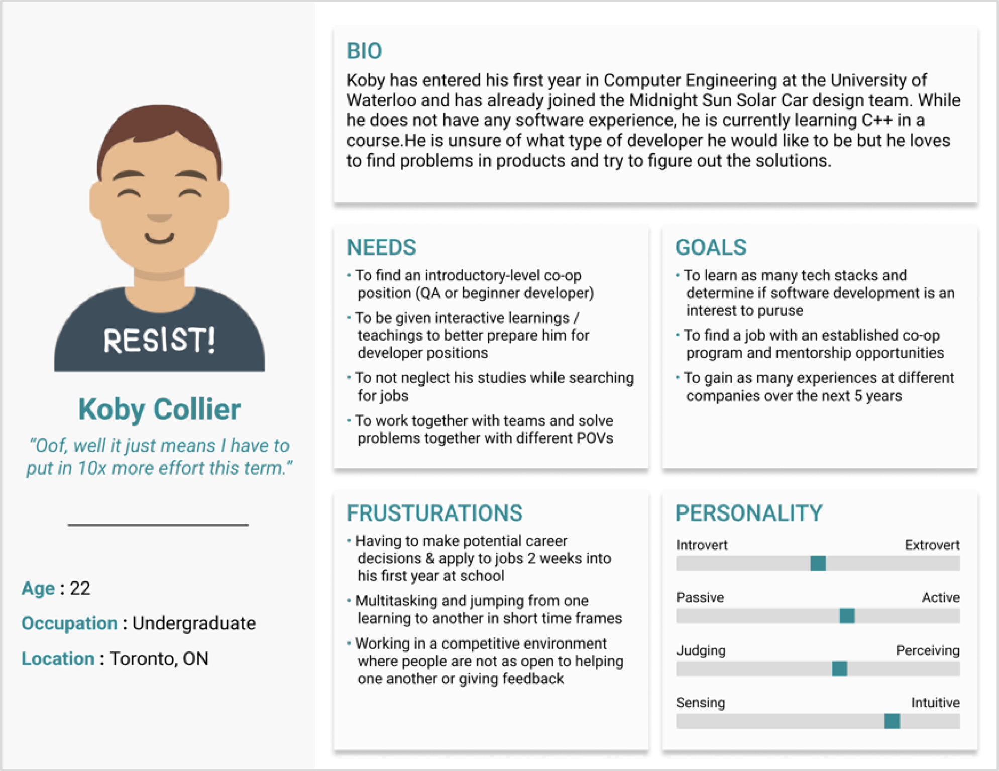
With all we’ve learned so far, we chose to create 3 personas that represent a spectrum of users we’ll be designing our solution for. Here is one of the three personas, modelling an eager first year student who is wanting a position that’ll broaden his range of technical skills:
COMPETITIVE ANALYSIS
Now that we have a greater understanding of our users, time to understand our competitors. How do other companies attract students? What content are companies presenting on their careers pages? What components should we introduce? These were some of the questions we were considering.
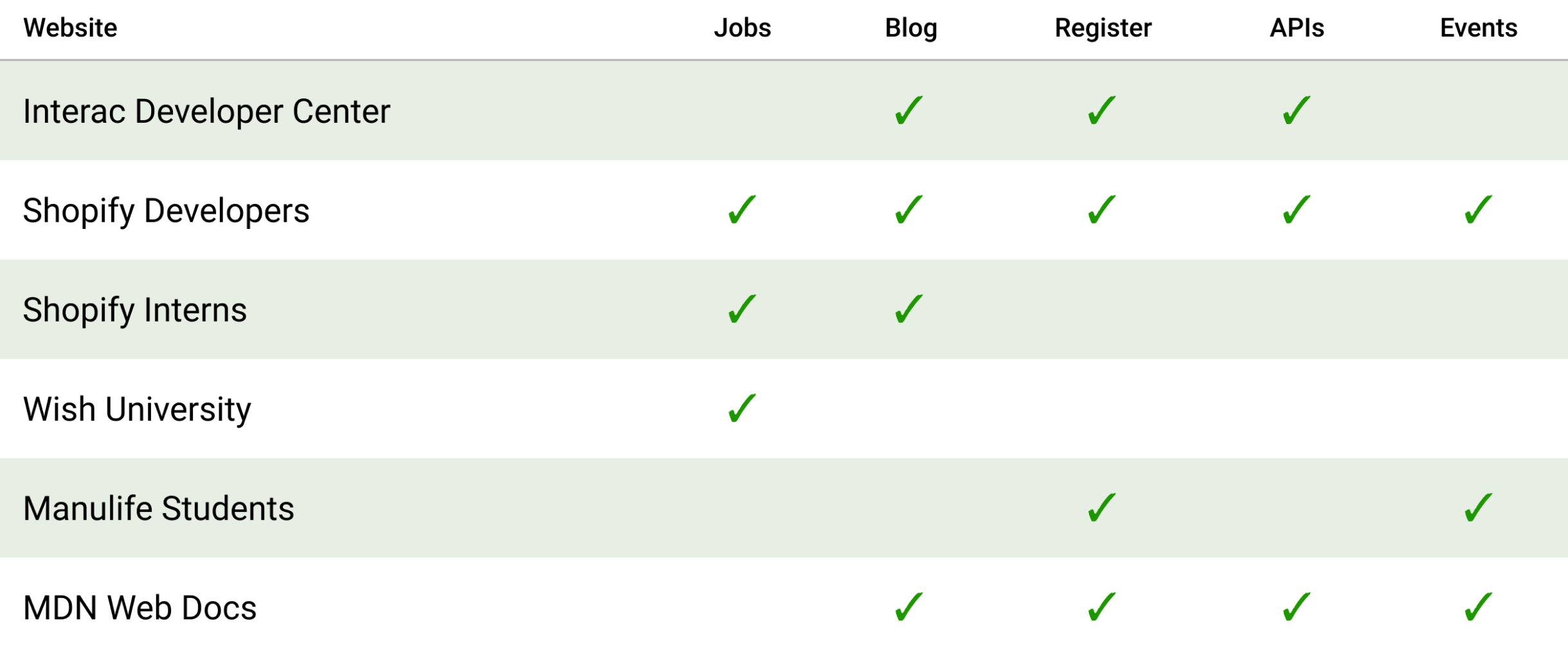
Plenty was learned from this, including ideas to shorten our banners so users land on more content-loaded pages, to introduce plenty of graphics and visuals for easy consumption, and to be sure not to introduce too much nested navigation.
02.
Develop a strategy
We spent the first few weeks learning about our users and filling out our problem space. With that stage completed, now came the time to strategize a solution. With our knowledge gained from user interviews and competitive research, we met with the product owner, a Marketing Officer and other Manulife employees to brainstorm the content for the site.
SITE MAP
Considering what users said, what stood out to us most with competitors, and what Manulife is requiring for the site, we developed the following site map:
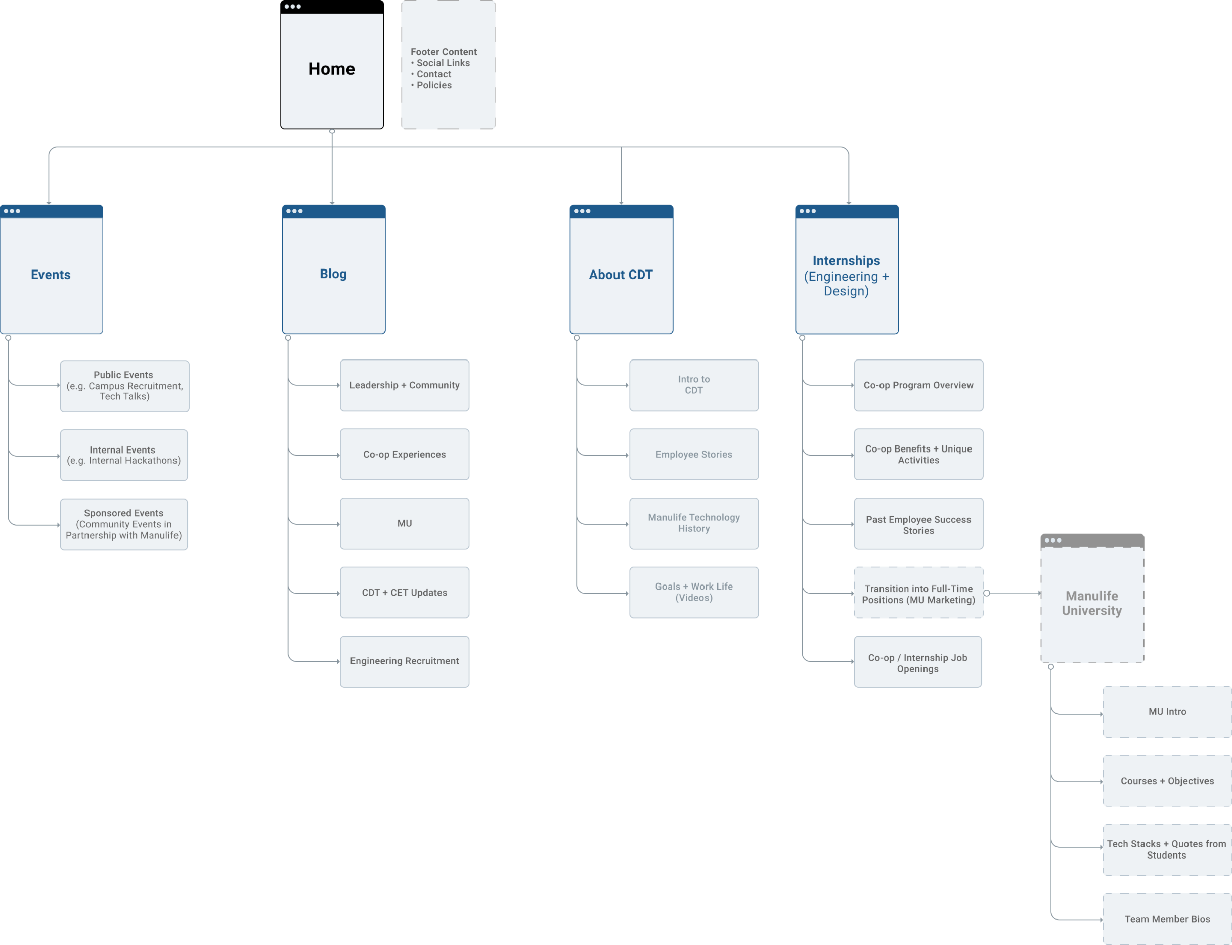
To help us stay aligned with stakeholders thorughout the design process, I set up weekly check-in meetings and introduced Agile concepts such as sprints, sprint planning and stand-ups.
USER FLOWS
We created user flows for some of the interactions we expect on our site. These were developed to help shape the designs we’ll create in the next stage of the process. Here’s an example of one of the flows we made, provided by my fellow design co-op:
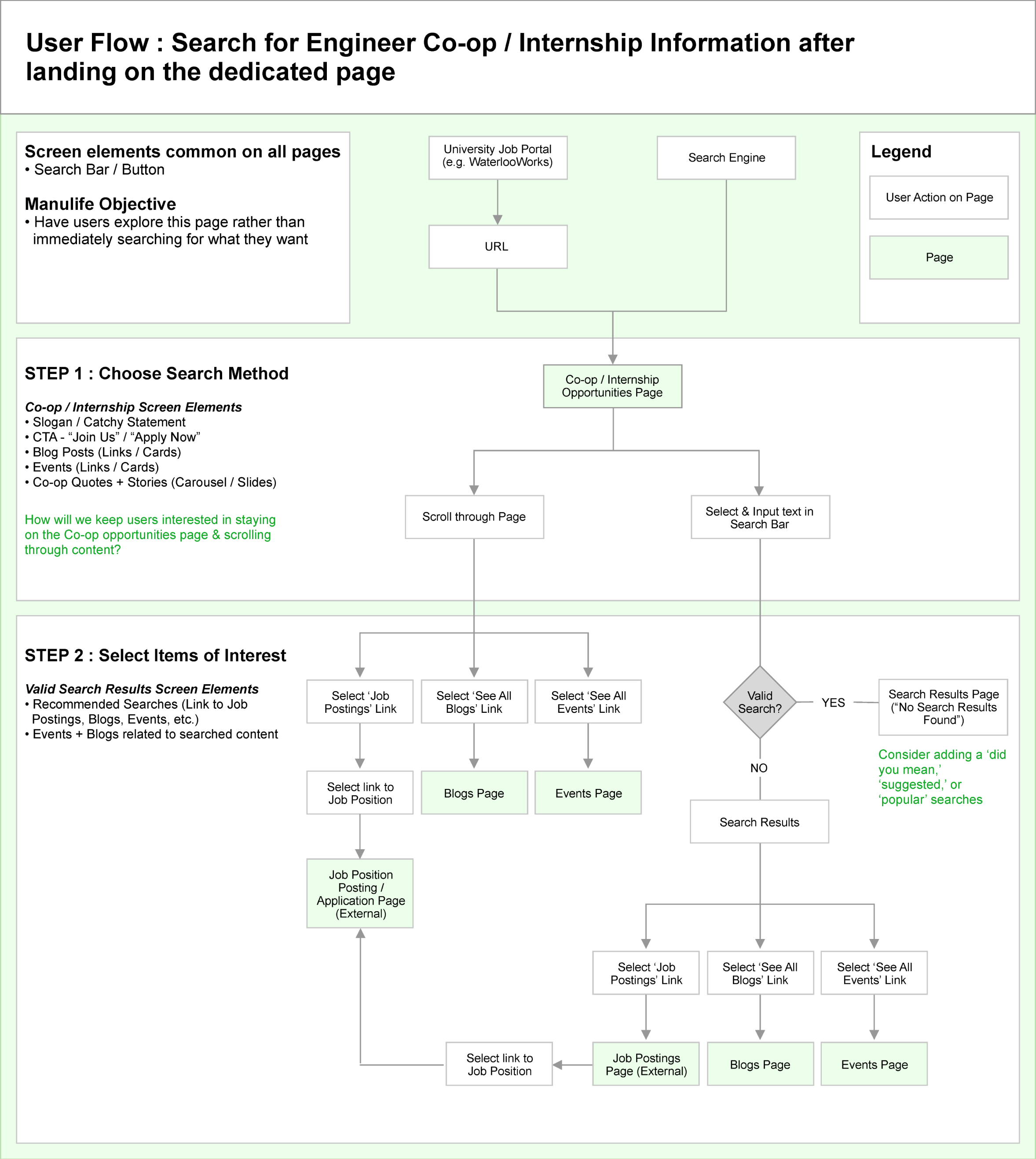
03.
Design a solution
WIREFRAMING AND A/B TESTING
I used Axure RP to create low-fidelity wireframes of the different pages that make up the solution. Low-fidelity mockups let us test the layout and flow of our site and redesign accordingly before investing too much design effort.
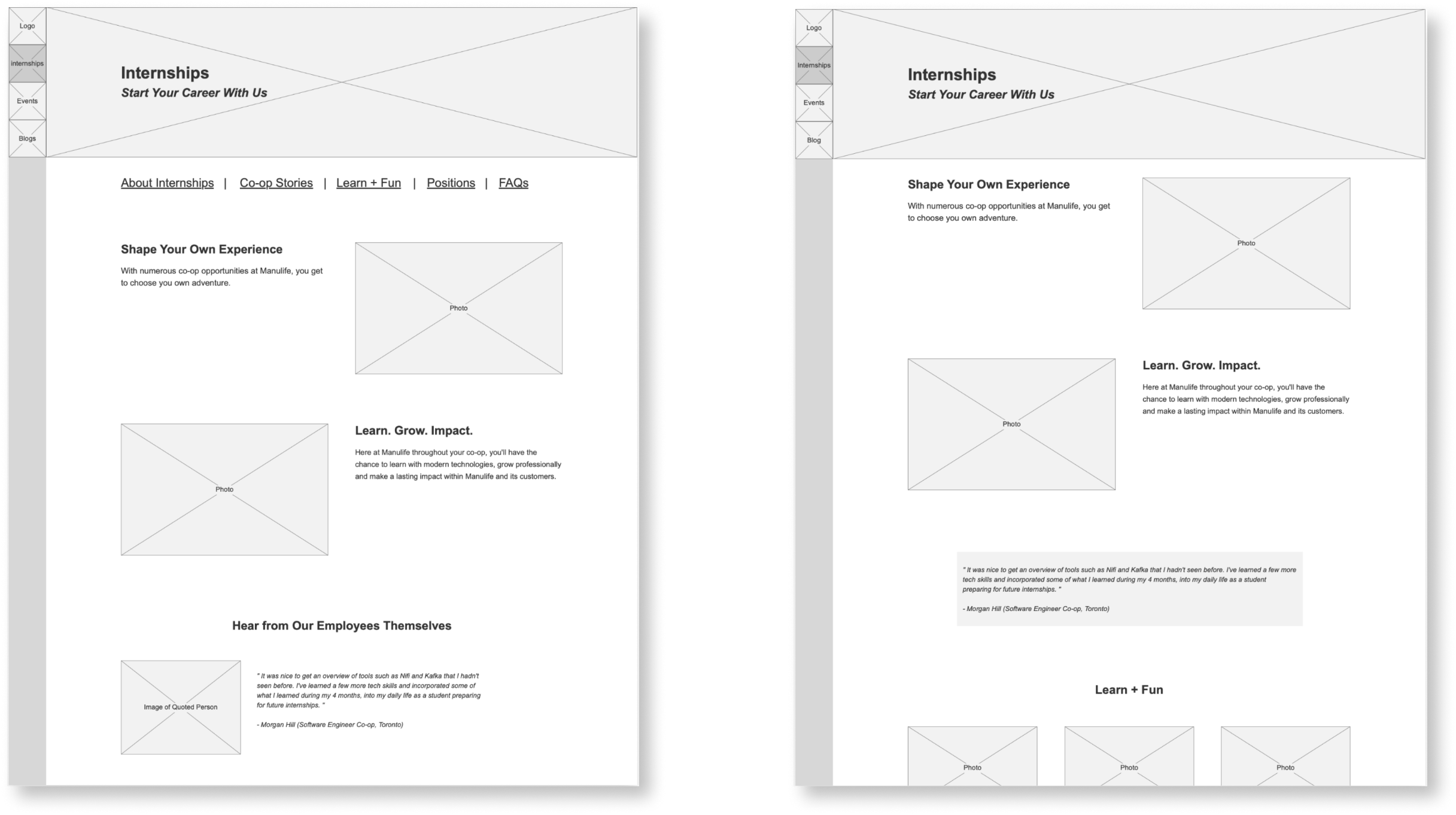
We created a test plan with open ended questions and conducted 8 tests on our designs. Users were presented with two versions of each page (A and B), such as the two featured above, and asked to provide feedback on all aspects.
Here's a look at some of the key findings:
These findings revealed the need for layout and content changes which we presented to our product owner. We continued to iterate on the wireframes before pushing to high-fidelity design.
DESIGN GUIDELINES
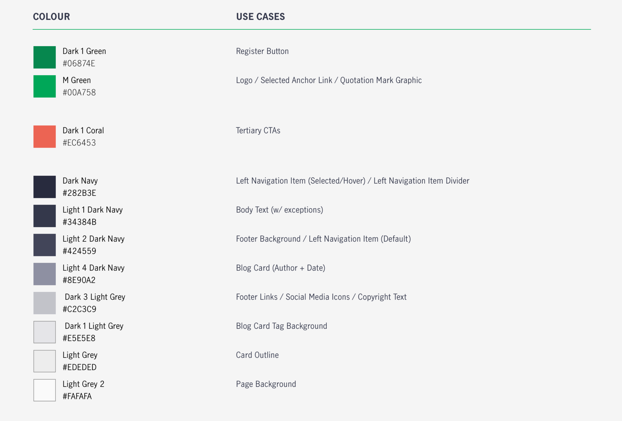
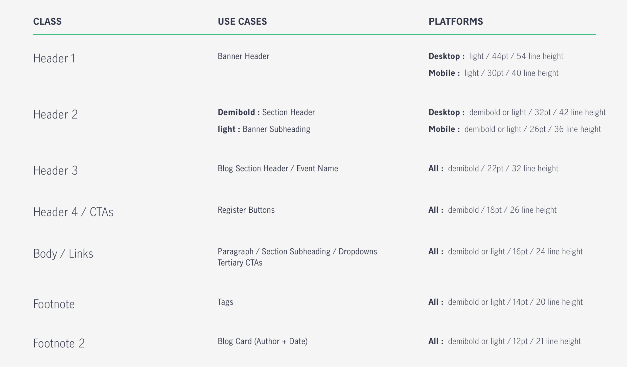
Using Manulife Canada’s design system, we created a style guide for the website to ensure that all visual design remains consistent across the platform.
Colours
Typography
FINAL SOLUTION
Using Sketch, we began to developing high-fidelity versions of the 5 unique pages within the platform. As we added to and modified each page, we continued to meet with stakeholders to realign and ensure we were on target with our designs.
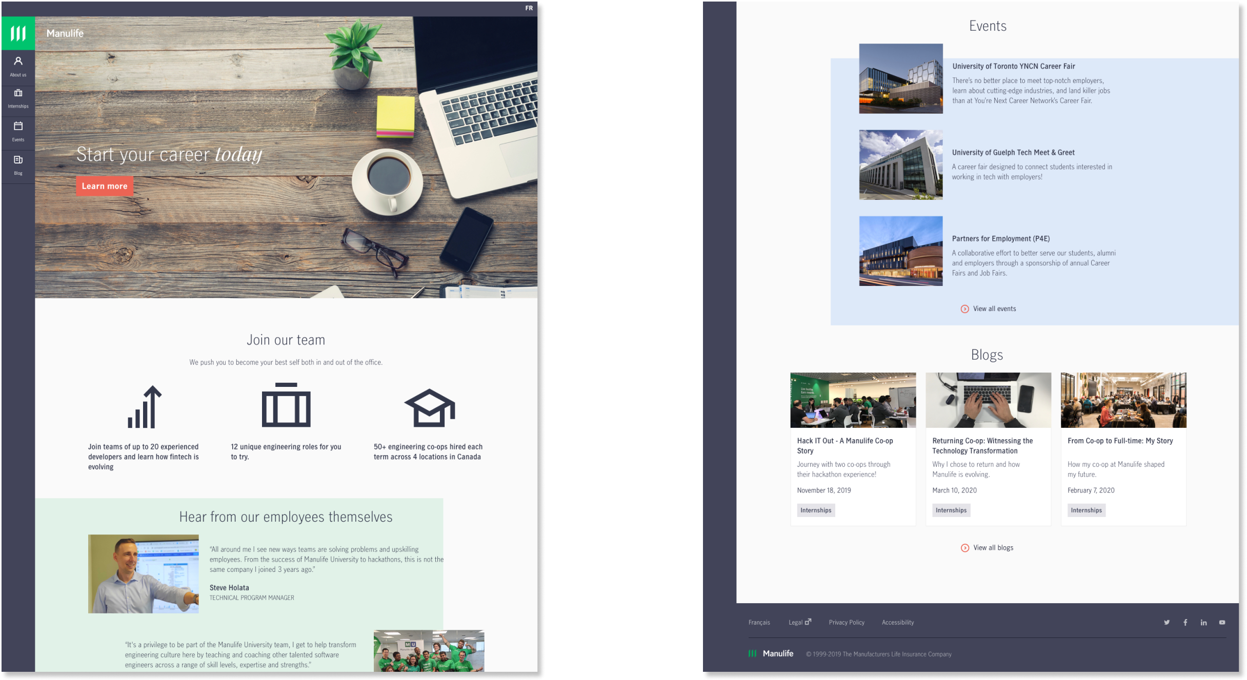
Landing
We promote metrics to advertise the internship program at Manulife then lead directly into quotes bragging about the experience’s users could have. The coloured, offset squares were inspired by competitive analysis into modern tech companies like Shopify.
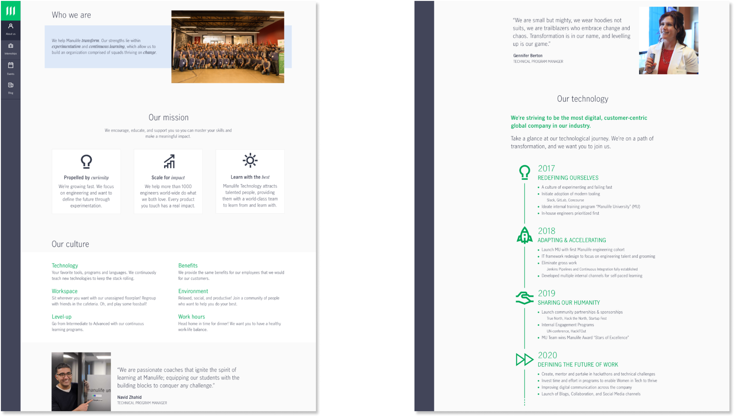
About Us
This page gives the user a quick glance at Manulife’s culture. A timeline was implemented to show readers that Manulife has come a long way technically in the last few years. The timeline is static to meet developer needs and was proven to be meaningful to users in the quick tests we did.
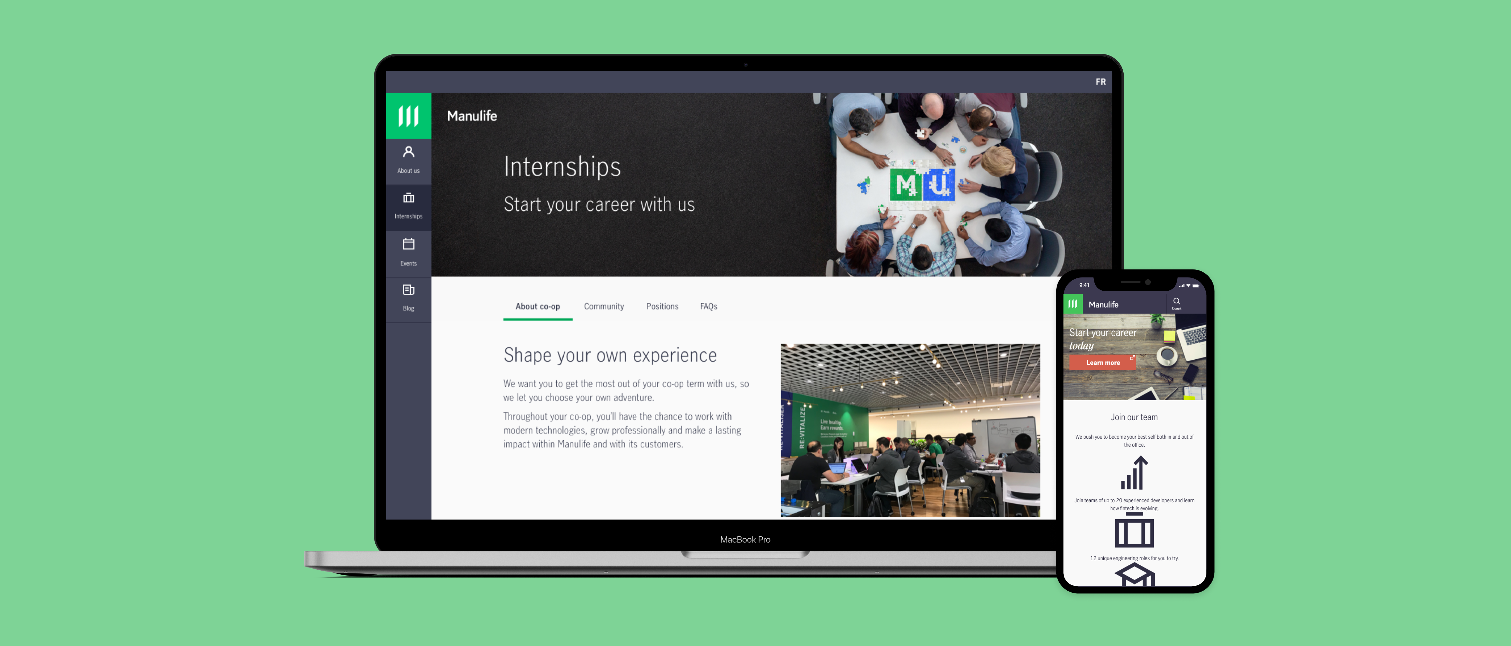
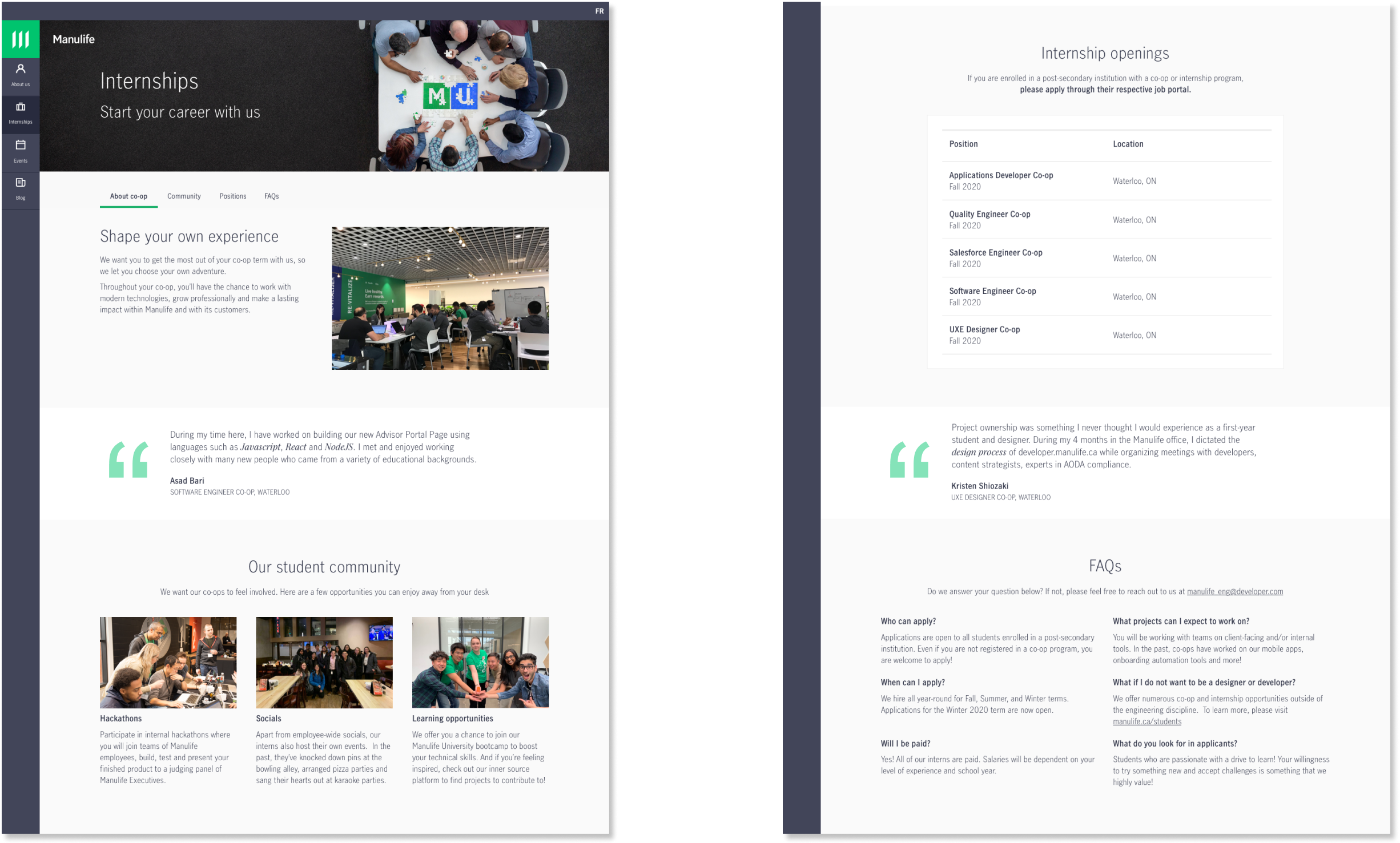
Internships
Here students will see what the internship program will entail. We highlight the community and innovative experiences an intern will encouter at Manulife to meet the needs we identified through surveys and interviews. We also provide a table listing Manulife’s openings for quick application.
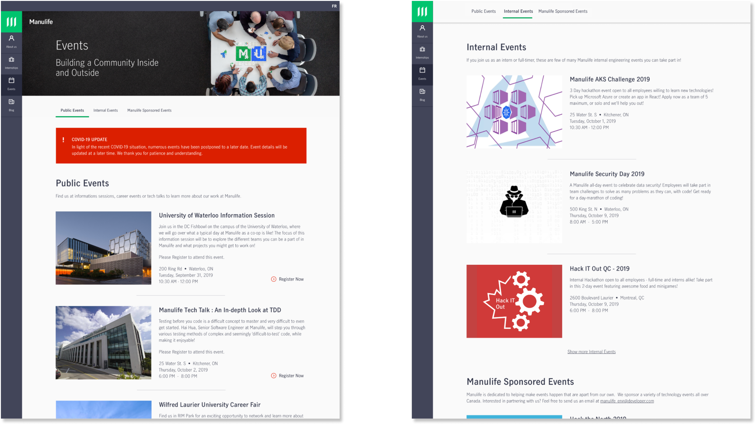
Events
An updated list of community and internal events that are available for interns at Manulife. We introduced anchor links to provide options for users to efficiently navigate to specific sections within the page.
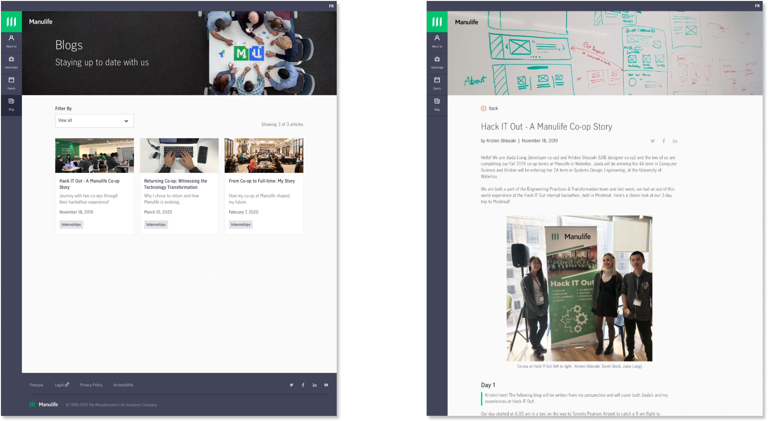
Blogs
Here we provide users with blogs to read-up about personal stories from working at Manulife. Design challenges for this page included the design of the cards themselves and the new filtering-by-tag system